Expert Tips to Transform Your Capital Region Living Room with the Perfect Color Palette

Picking out a color palette for your living room is about so much more than just what color you’ll be rolling on the walls. You're actually setting the entire mood for the heart of your home—the space where your family gathers. A little planning goes a long way in creating balance, showing off your personality, and turning four walls into a truly cohesive and inviting space for your home in the Albany, Troy, or Schenectady area.
Laying the Foundation for Your Color Palette
So, where do you start? Since opening our family-owned store in 1978, our designers have relied on a simple but incredibly effective strategy: the 60-30-10 rule. This isn't some rigid, complicated formula. It's just a time-tested framework that helps you get a balanced, professional-looking space without all the guesswork.
Think of it as the secret to making sure your colors play nicely together instead of fighting for the spotlight. It's a cornerstone of the Expertise we bring to every design project, right from our Freehold, NY showroom.
Here's a quick look at how this simple ratio works in a real room:
- 60% is your main color. This is the big one—the dominant shade that sets the overall tone. It's almost always your wall color. You can think of it as the main canvas for your entire design.
- 30% is your secondary color. This color is there to support the main one. You'll see it in larger pieces like your sofa, area rug, or curtains. It adds depth and interest without being overpowering.
- 10% is your accent color. Now for the fun part! These are your pops of personality. Use this color sparingly for smaller items—throw pillows, a vase, or a piece of art—to inject visual energy and draw the eye.
Warm vs. Cool Tones
Beyond just the ratio, getting a feel for warm and cool tones is a game-changer. Warm colors—think reds, oranges, yellows, and cozy beiges—create an atmosphere that feels energetic and inviting. Our experts find they work wonders in making a large, cavernous room in a Capital Region home feel more intimate and snug.
On the other hand, cool colors like blues, greens, purples, and crisp grays tend to feel more calm and airy. They are fantastic for creating a serene retreat or giving a smaller living room a more spacious vibe.
The real magic happens when you mix them. A beautiful, sophisticated room often combines both—imagine a warm leather sofa set against cool gray walls. That contrast creates a dynamic and perfectly balanced feel.
If you’re just starting to gather ideas, browsing different living room colour scheme ideas can show you how different palettes come to life. And when you’re ready to get specific, you can explore more about how to use color to set the mood in any room.
Discovering Your Personal Color Signature
Before you even think about picking up a paint swatch, let's talk about the real starting point for any successful living room project: you. The best color palette for your living room isn’t about what’s trending; it’s about what makes you feel genuinely at home. Do you want a space that feels like a jolt of energy, or a quiet, calming retreat?
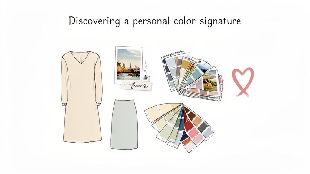
Figuring this out is easier than it sounds. Honestly, the clues to your personal color signature are already all around you. A great first step? Open your closet. The go-to colors you reach for without even thinking are usually the shades you'll be most comfortable living with day in and day out.
Finding Inspiration in Your Life
Your personal style is a fantastic foundation for building a color scheme you won’t get tired of in a year. But don't just stop at your wardrobe! Look around at other things that bring you joy.
- Your Favorite Artwork: That painting or print you absolutely love? It’s basically a pre-made, professionally balanced color scheme. Pull out a few of the dominant and accent colors, and you have an instant starting point.
- A Memorable Vacation: Think back to a favorite trip. Were you drawn to the warm, earthy tones of the Adirondacks or the cool blues of the Hudson River? Tapping into those memories can bring powerful, positive feelings right into your home.
- Your Personal Passions: Do you love spending time in your garden? A palette inspired by nature—soft greens, rich soil browns, and pops of floral pinks—could be a natural fit.
After 45+ years in this business, we've learned a simple Truth: the most stunning living rooms are always the ones that feel like a true reflection of the people who live there. They tell a story and feel collected over time, not decorated overnight.
Moving Beyond Generic Trends
We’re seeing homeowners everywhere, from Albany to Freehold, turn away from those sterile, one-size-fits-all looks. There's a clear shift toward spaces that showcase individual personality and comfort over following a strict design rulebook. People want their living rooms to feel like theirs.
If you want to test-drive your ideas without any commitment, our Free Online Room Planner is a game-changer. It lets you play around with different color combinations digitally, so you can see how your personal palette looks on the walls and with different furniture styles before making any real-world decisions.
By starting with what you love, you'll create a space that’s not just beautiful, but deeply and authentically you. Our team is here to help you translate that personal style into a workable plan.
Building a Palette Around Your Key Furniture
Your furniture isn’t just there to be used; it’s the heart of your living room's design and usually represents your biggest investment. That’s why our expert designers always recommend using these "anchor" pieces as the starting point for a beautiful color palette for your living room. A stunning sofa or a handcrafted media console holds all the clues you need.
Instead of getting overwhelmed by a wall of paint chips, take a close look at the furniture you already have and love. A patterned armchair might have a subtle thread of color—a deep navy or a warm terracotta—that you can pull out and feature as your 10% accent shade. Even a solid-colored sofa has undertones that can guide your choice for the walls.
Drawing Inspiration from Wood and Fabric
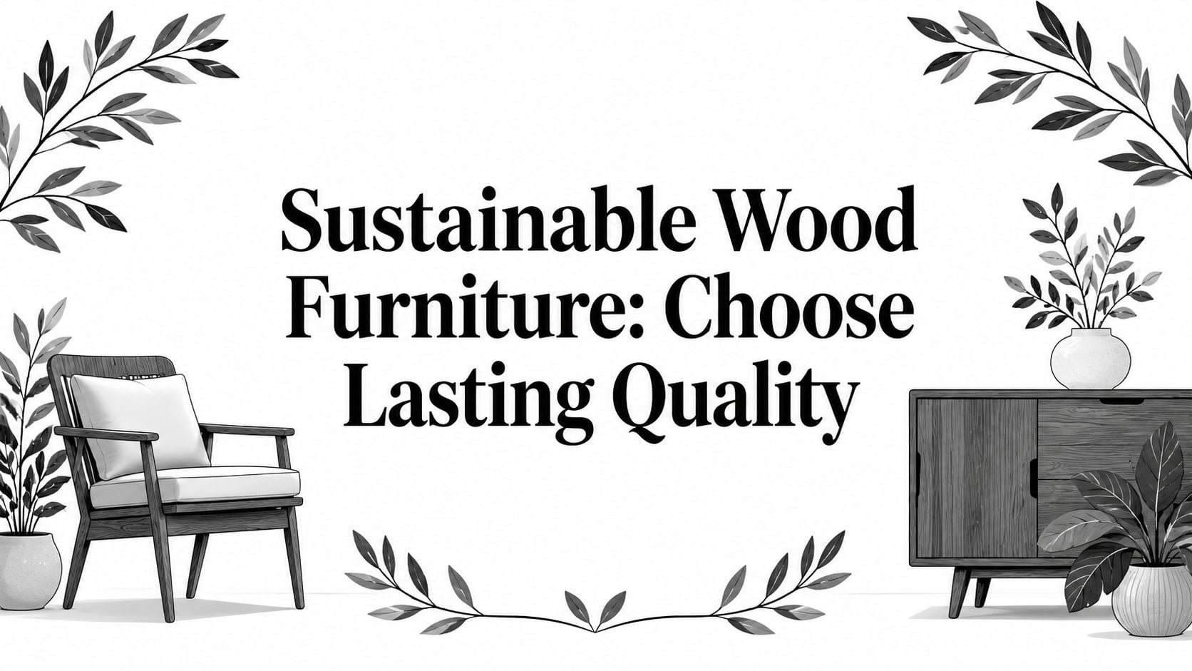
Wood finishes are an incredible, and often overlooked, source of inspiration. A solid oak table from our Amish Furniture collection isn’t just "brown"; it’s a beautiful mix of rich gold, amber, and caramel tones living together in the grain.
- Warm Woods (Oak, Cherry, Mahogany): These pieces feel right at home with warm wall colors. Think creamy beige, soft sage greens, or even a dramatic, earthy red.
- Cool Woods (Maple, Ash, Light Walnut): These look absolutely stunning against cooler tones like a slate blue, a gray-green, or a crisp, clean off-white.
The texture and color of your upholstery are just as important. That cozy chenille sofa creates a completely different mood than a sleek leather recliner. You can get a better sense of how different materials influence a room's feel by exploring the world of upholstery fabrics and their characteristics.
Our design philosophy, honed since we first opened our doors in 1978, is simple: let your most-loved pieces lead the way. When you build a palette around your furniture, you're guaranteeing a timeless look because it’s grounded in something you’ve already chosen with care.
Starting Fresh with Customization
Now, if you're furnishing a room from scratch, the possibilities are wide open. This is the perfect time to come visit us at our Freehold, NY showroom. Seeing and touching furniture from our 50+ trusted manufacturers in person can spark some incredible ideas. You might fall in love with the deep, rich finish of an Amish-made bookcase and decide right then and there to build your entire palette around that one piece.
This is also where our Custom Order service becomes your best friend. Found the perfect sofa style but you’ve been dreaming of it in a rich olive green to match your vision? We can absolutely make that happen. By selecting the exact fabric or finish from the get-go, you ensure your new furniture and color scheme are in perfect harmony, a service we're proud to offer our Capital Region customers.
Inspiring Palettes for Capital Region Homes
Ready for some real-world inspiration? To help you get a feel for the possibilities, we’ve put together three distinct color palettes we see a lot in Upstate New York homes—from cozy farmhouses near Albany to modern retreats out in Greene County. Each one sets a completely different mood and makes a fantastic starting point for your own living room project.
This little graphic is a great visual for the simple process our designers follow.
It always starts with your anchor furniture. From there, you layer in the material details and visualize the final touches with textiles. It's a method that creates a thoughtful, pulled-together design every single time.
The Warm and Earthy Palette
This look is all about creating a cozy, inviting atmosphere that feels like a warm hug. Think creamy beiges, soft caramels, and muted terracotta tones.
It’s no surprise that warm and earthy tones have emerged as the dominant color category in home design lately. Major paint brands are featuring colors that give you more personality than plain white but stay neutral enough to work with your existing furniture. These colors look especially beautiful with the natural materials in our solid wood Amish furniture, like oak and cherry. For more on this trend, check out the latest 2024 staging trends on floridarealtors.org.
The Bold and Expressive Palette
If you’re the kind of person who wants their living room to make a confident statement, this is the palette for you. This style uses sophisticated jewel tones and deep, moody hues to create a space that feels luxurious and incredibly personal.
We're talking rich navy blue, deep emerald green, or even a dramatic berry red. These colors are fantastic for an accent wall behind a media center or as the main event on a stunning, custom-ordered sofa. The trick is to balance these intense shades with plenty of neutral elements to keep the room from feeling too heavy.
The Calm and Coastal Palette
Drawing inspiration from the serene landscapes of Upstate New York, a calm and coastal palette creates a tranquil escape right in your living room. And no, this isn't about seashells and anchors! It's a much more refined take that uses soft blues, muted sage greens, and sandy off-whites.
This color palette for a living room is perfect for making smaller spaces feel larger and more open. It pairs wonderfully with light wood finishes, woven textures, and comfortable, USA-made mattresses and upholstery, creating an airy and relaxed environment for the whole family to enjoy.
Our Pro Tip: No matter which palette you choose, remember the 60-30-10 rule. It’s the simplest way to ensure your colors are balanced perfectly—a technique our designers have used since we started offering design services back in 1984.
To help you see how that works, here’s a quick breakdown of how the rule applies to each of our sample palettes.
Sample Living Room Color Palettes
| Palette Style | 60% (Main Color – Walls) | 30% (Secondary Color – Furniture/Flooring) | 10% (Accent Color – Decor/Pillows) |
|---|---|---|---|
| Warm & Earthy | Creamy Beige or Warm White | Caramel Leather Sofa, Oak Tables | Terracotta, Olive Green |
| Bold & Expressive | Soft Gray or Muted Greige | Deep Navy Sectional, Walnut Console | Brass, Mustard Yellow |
| Calm & Coastal | Pale Blue or Light Sage | Light-Colored Linen Sofa, Ash Wood | Sandy Beige, Muted Coral |
See how breaking it down this way makes it feel much more manageable? It’s a simple formula that gives you a cohesive, professional-looking result every time.
Coordinating Colors with Flooring and Light
A gorgeous color palette can fall completely flat if it doesn’t play well with the two biggest influencers in your living room: the flooring and the light. These are the foundations of your space, and they can dramatically change how any color looks and feels. To create a room that truly feels cohesive, you have to plan from the ground up.
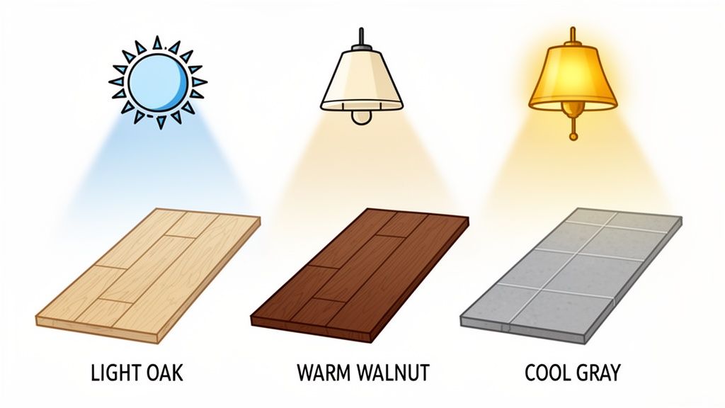
Think about it—your floor covers a massive amount of visual real estate. Its undertones set the stage for everything else. A warm cherry hardwood will bring out the cozy side of a beige paint. On the other hand, a cool, gray-toned laminate might make that exact same beige look dull and muddy. The trick is to identify whether your flooring leans warm, cool, or neutral and then pick wall colors that share that same "temperature."
This is where our one-stop shopping approach really makes a difference for homeowners in the Greater Albany Capital Region. Because we have an in-house Flooring department, our design experts can pull everything together at once—furniture, paint, and flooring—to create a seamless, professionally designed look. If you want to dive deeper, you can learn more about how to pair paint and furniture with different colors of wood floors in our detailed guide.
How Light Changes Everything
Just as critical as your flooring is the light your living room gets. Natural light is a moving target; it casts a cool, almost blueish hue in the morning, then shifts to a warm, golden glow in the late afternoon. And that’s before you even turn on a single lamp, which introduces its own artificial color temperature.
The single biggest mistake we see is people choosing a paint color based on how it looks under the harsh fluorescent lights of a hardware store. We guarantee that color will look completely different once you get it home.
To avoid any unwelcome surprises, you absolutely must test your colors in the room they're going to live in. Here’s a pro tip from our team: paint large swatches on a few different walls and watch how they change throughout the day.
- Morning Light: See how the color feels in that bright, crisp morning light.
- Afternoon Sun: Notice how it shifts as warmer, more direct sunlight streams in.
- Evening (Artificial Light): Flip on your lamps and overhead lights to see its nighttime personality.
This simple process, a favorite of our design team since 1984, is the secret to ensuring the color palette for your living room looks exactly how you imagined it, no matter the time of day. It’s this kind of attentive, local expertise that takes a room from good to truly great.
Bringing Your Vision to Life with Local Experts
Feeling that spark of inspiration but want a guiding hand to pull all the details together? We understand. Choosing the right color palette for your living room can feel like a massive commitment, especially when there are so many beautiful directions you could go. This is where our family comes in, helping you move from a collection of ideas to a finished space you'll absolutely love.
For over 45 years, our family-owned business has helped homeowners all over the Greater Albany Capital Region do just that. Our complimentary Expert Design Services have been a cornerstone of what we do since 1984, providing that personal, experienced touch. Our designers are fantastic at coordinating everything—from the big pieces like furniture and flooring right down to the final decorative accents.
Navigating Today's Color Trends
So, what's happening in the world of color right now? We're seeing a huge shift toward spaces that genuinely reflect individual personality. Designers are playing with sophisticated jewel tones and hues pulled straight from nature. Believe it or not, smoky jades are even becoming the "new neutrals."
We’re also seeing a lot of berry tones and deep reds bringing incredible warmth and character into homes. Our experts can show you how to confidently bring these beautiful, statement-making colors into your own home without it feeling overwhelming. We have the Authoritativeness and hands-on experience to make it work.
At Tip Top, we believe creating your dream living room should be an enjoyable process, not a stressful one. Since 1978, our goal has been to provide the local expertise that makes it simple and accessible for everyone.
We know that projects of any size need a practical plan, which is why we offer Flexible Financing options to make budgeting simpler. When you're ready to see things in person, we'd love for you to stop by our Freehold, NY showroom. From heirloom-quality Amish furniture to some amazing finds in our Clearance section, we’re here to help you create a space that feels perfectly, completely you.
Still Have Questions? We’ve Got Answers.
As a family-owned business serving the Greater Albany Capital Region since 1978, we've heard just about every question you can imagine when it comes to picking a living room color palette. We get it—it's a big decision!
Here are a few of the questions we hear most often in our Freehold showroom, along with our best advice.
How Do I Pick a Color That Won't Go Out of Style?
The secret to a look that lasts? Turn to nature. Colors like warm beiges, creamy off-whites, and soft, muted greens always feel current. They create a beautiful, flexible backdrop that you can easily update with new pillows or throws as trends evolve.
When you pair these classic colors with furniture that has real, enduring quality—like our solid wood Amish-made pieces—you’re building a foundation that can truly last for generations. This is the heirloom quality we are proud to offer.
Is It Okay to Mix Warm and Cool Colors?
Absolutely! In fact, some of the most sophisticated and well-designed rooms do exactly that. The trick is to let one temperature lead the way and use the other as an accent.
For instance, if your room is grounded in the warmth of beige walls and a brown leather sofa, you can bring in cool tones with blue pillows, art in silver frames, or even a few lush green plants. If you're struggling to get that balance just right, our complimentary Expert Design Services can help you find that perfect, polished harmony.
What Colors Make a Small Living Room Feel Bigger?
When you want to create a sense of space, lighter and brighter colors are your best friend. Think soft whites, light grays with warm undertones, or even pale blues. These shades are fantastic because they reflect light, making any room feel more open and airy.
Pro Tip From Our Designers: Another great trick is to pick furniture with visible legs, like a mid-century modern sofa or console table. When you can see more of the Flooring, it creates an illusion of spaciousness that really enhances that open feeling.
At Tip Top Furniture & Mattresses, our team is here to help you move from planning to actually enjoying a beautiful new living room. As your one-stop shop with local expertise, we offer everything from furniture and flooring to Custom Order options and flexible financing. We make the whole process simple and fun.