Black and White Bathroom Art: Humidity-Proof Decor
A bathroom can be beautifully finished and still feel unfinished. The tile is in, the vanity works, the lighting is better than before, but the room still reads as strictly functional. That's the moment when wall art often makes the difference, especially in smaller baths and powder rooms across the Capital Region where every surface has to earn its place.
Black and white bathroom art solves a common decorating problem. It adds contrast and personality without fighting the mirror, the plumbing, or the tile. In Upstate New York homes, it also has to do something more practical. It has to hold up through steam, winter condensation, and the day-to-day wear that comes with a real family bathroom.
Table of Contents
- Why Black and White Art Is Perfect for Your Bathroom
- Matching Art Styles to Your Bathroom's Look
- Choosing Humidity-Safe Materials That Last
- Getting the Scale and Placement Just Right
- Framing and Hanging Art for a Bathroom Environment
- Your Local Partner in Home Design
Why Black and White Art Is Perfect for Your Bathroom
A bathroom asks for restraint. There are already hard surfaces, bright reflections, and a lot of visual activity packed into a small footprint. Black and white art brings in interest without making the room feel busy.
That matters even more now that bathrooms are moving away from plain white everything. In a Fixr survey of 60 design experts, 36% named patterned tiles as a top trend, as cited by the National Association of Realtors in its look at bathrooms getting drenched in color. In practical terms, that means many homeowners around Albany, Schenectady, and Troy are pairing expressive surfaces with simpler accents that restore balance.
Black and white art does that job well. It sharpens the room. It gives the eye a place to land. It also keeps the clean, calming quality that many people still want from a bathroom, even when they're bringing in warmer wood tones, darker cabinetry, or patterned wall tile.
Practical rule: In a bathroom with strong tile, the art doesn't need more color. It needs clearer contrast.
There's also a reason monochrome keeps showing up in rooms that need to last stylistically. It bridges old and new. It works with traditional homes in Greene County, newer renovations near Albany, and in-between spaces where the fixtures have been updated but the architecture still leans classic.
For homeowners trying to understand why black and white art is cool, the answer is simple in a bathroom. It's versatile, graphic, and hard to tire of. It can feel refined, minimal, dramatic, or calm depending on the subject and the frame.
Color still matters around it, of course. A piece that looks crisp against white shiplap may disappear against charcoal paint or a heavily veined tile wall. That's why it helps to think through the room as a whole, including the finishes already in place. For anyone building a coordinated scheme from the ground up, Tip Top's guide to the perfect color palette is a useful next step.
Matching Art Styles to Your Bathroom's Look
The most successful black and white bathroom art isn't chosen by color alone. It's chosen by subject, line quality, and visual weight. A modern bathroom can carry a very different piece than a cottage-style powder room, even if both are strictly monochrome.
Abstract pieces for bold and modern rooms
Abstract art works well when the bathroom already has strong architecture or clean-lined fixtures. It can echo the geometry of a floating vanity, a frameless mirror, or large-format tile without replicating those shapes exactly.
This is often the right move in contemporary bathrooms where the room needs energy but not clutter. A black brushstroke composition, tonal blocks, or a high-contrast organic abstract can make a modern room feel finished without introducing a theme.
Bathrooms with a more updated look often benefit from this approach:
- Sharp cabinetry lines pair well with art that has structure and edge.
- Bold tile or darker finishes usually need artwork with a clear silhouette, not tiny detail.
- Minimal accessories leave room for one statement piece to do more of the work.
A homeowner comparing style directions may find it helpful to look at contemporary vs traditional design styles before settling on the art subject.
Photography for classic and tailored bathrooms
Black and white photography tends to suit bathrooms with a more grounded, finished feel. Think traditional vanities, polished hardware, beadboard, marble-look counters, or a room with older architectural charm.
Photography brings realism and depth. Natural vistas, coastal scenes, architecture, and vintage-inspired studies often feel especially appropriate because they add character without turning the bathroom into a novelty space. The key is selecting an image with enough tonal separation to read clearly from across the room.
A bathroom mirror already adds visual complexity. Photography works best when the image has one strong focal point instead of dozens of tiny competing details.
Line art for lighter and quieter spaces
Minimalist line art is a natural fit for Scandinavian-inspired baths, softer transitional rooms, and powder rooms where the goal is calm. It has a quiet presence that works with lighter oak, matte black fixtures, white walls, and simpler ceramics.
It's also a smart choice for smaller homes and guest baths in the Capital Region where a full visual statement would feel too heavy. The caution is that line art can disappear if there isn't enough contrast around it.
A few selection cues help:
- Use line art on simpler walls where the background won't swallow it.
- Choose heavier black lines if the bathroom has dim lighting.
- Keep the frame intentional so the piece doesn't read as an afterthought.
If the right piece isn't available off the shelf, custom ordering can make sense. That might mean adjusting scale, finish, or frame tone so the art relates to nearby wood and metal surfaces instead of merely filling an empty wall.
Choosing Humidity-Safe Materials That Last
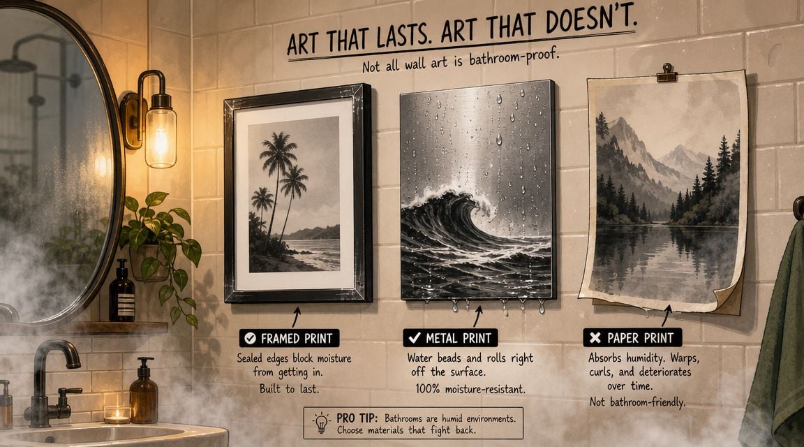
Style gets attention first, but material choice decides whether the art still looks good after repeated steam exposure. That's the part many homeowners don't hear enough about.
Independent bathroom decor guidance notes that the biggest challenge for bathroom art isn't style, but survival, and that in a humid room failure usually comes from moisture ingress, not color shift, which makes sealed edges and wipeable surfaces more important than the image itself in this bathroom art materials discussion. That lines up with what works in four-season homes around Freehold and the greater Albany area, where humidity can swing with weather, heating systems, and heavy shower use.
Good better best materials for bathroom walls
A simple way to think about material choice is good, better, best.
| Level | Material approach | Where it fits | Main trade-off |
|---|---|---|---|
| Good | Properly framed paper print with protective glazing and sealed backing | Powder rooms or lightly used baths | Looks refined, but needs more protection from steam |
| Better | Professionally sealed museum-wrap canvas | Guest baths and moderately humid bathrooms | Softer surface appearance than acrylic or metal |
| Best | Sealed acrylic or other wipeable, moisture-tolerant surface | Full baths used daily | More practical, but can feel less soft or traditional |
A framed paper print can absolutely work, but only when the framing is done correctly and the room isn't taking constant steam. Cheap open-back frames are where trouble starts. Moisture gets in behind the art, backing warps, and the whole piece begins to fail from the rear before the front looks damaged.
Sealed canvas is a strong middle-ground choice. It avoids some of the trapping issues of a traditional frame, and it can hold up well when the edges are properly finished. This option often suits homes that want a softer, more decorative look than a rigid glossy panel.
Acrylic and similarly sealed surfaces make the most sense in bathrooms that see daily showers. They're easier to wipe down, less vulnerable to ambient moisture, and generally more forgiving in spaces where ventilation isn't ideal.
What usually fails first
The image itself often isn't the first problem. The weak points are usually hidden:
- Unsealed edges let moisture move inward.
- Thin backing can warp or soften.
- Low-grade hanging hardware corrodes.
- Frames with poor rear sealing allow damp air behind the print.
The bathroom tests the construction of the piece more than the artwork on the front.
Homeowners sometimes spend too much attention on subject matter and not enough on build quality. A handsome monochrome print in a flimsy frame won't age well near a vanity or shower path.
Bathrooms with wet-room characteristics need even more caution. Homeowners researching broader layout and waterproofing ideas may find this guide to wet room remodeling for Michigan homeowners useful as a planning reference, especially when the art will live in a room with open splash zones and constant moisture exposure.
How to choose for a full bath versus a powder room
Not every bathroom needs the same solution.
A powder room is usually forgiving. There's less steam, fewer temperature swings from bathing, and more freedom to use framed paper or decorative finishes that might be risky elsewhere.
A full bath requires stricter choices. That's where sealed surfaces, cleaner-able finishes, and tightly finished edges become much more important. In these rooms, the most minimal look isn't always the smartest one. A delicate matte print may suit the aesthetic, but a wipeable surface often suits how the room is used.
Material selection should also relate to the room's other finishes. Black and white art next to stained wood, brushed metal, or painted cabinetry needs a surface and frame finish that doesn't clash. Homeowners comparing stain depth and undertone in nearby millwork may also find value in reviewing custom wood finishes for the home so the art and the vanity don't feel disconnected.
One practical source for wall decor is the art category at Tip Top Furniture & Mattresses, especially for homeowners who want to coordinate art with furniture, flooring, and other finishes in one project.
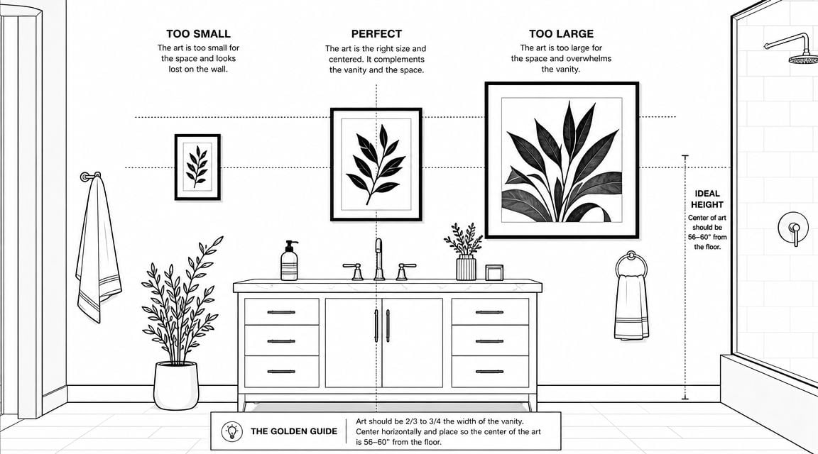
Getting the Scale and Placement Just Right
A well-made piece can still look wrong if it's undersized or placed where the mirror and fixtures overpower it. In bathrooms, scale matters more than many people expect because hard surfaces bounce light and break up the wall.
Curated market examples consistently show a common mistake. Underscaled art disappears, especially in compact bathrooms where reflective fixtures already compete for attention. The stronger installations use larger pieces with enough breathing room around them so the monochrome palette reads as deliberate, as seen in this overview of black and white bathroom art examples.
Where larger art works best
Oversized black and white bathroom art often performs best in the trickiest wall zones:
- Above a towel bar, where a tiny frame can look fussy
- Beside a mirror, where the art needs enough presence to stand up to reflected light
- Above a vanity wall area, when there's open space beyond the mirror itself
Over the toilet is another frequent placement, but the piece still has to be scaled to the wall, not just to the fixture below it. If the wall is broad, a very small print will feel stranded.
A good visual checkpoint is simple. The art should look connected to the architectural zone around it, not like it was squeezed into leftover space.
How to keep negative space working for you
Negative space is what makes black and white art feel intentional. Without it, the room can read crowded. With too much of it, the art looks timid.
That's why larger pieces often beat small ones in bathrooms. One strong work with open wall around it usually looks calmer than several tiny frames scattered between switches, outlets, mirrors, and hardware.
Small art often asks the eye to work too hard in a room that already has chrome, glass, grout lines, and reflections.
When the wall is especially large, a homeowner can test proportions before buying by sketching paper templates or using a planning tool. For more ideas on proportion and impact, this guide to big wall art ideas gives a helpful sense of how larger pieces anchor a room.
Framing and Hanging Art for a Bathroom Environment
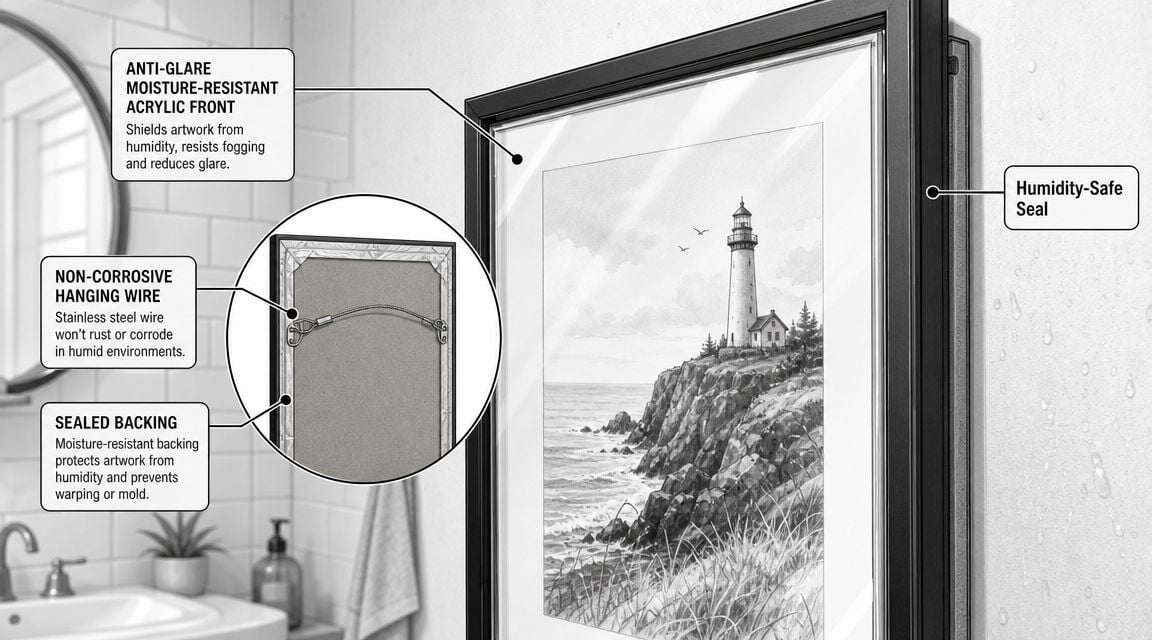
The final step is where a lot of bathroom art installations go wrong. The print may be moisture-safe, but the frame, backing, or hardware isn't.
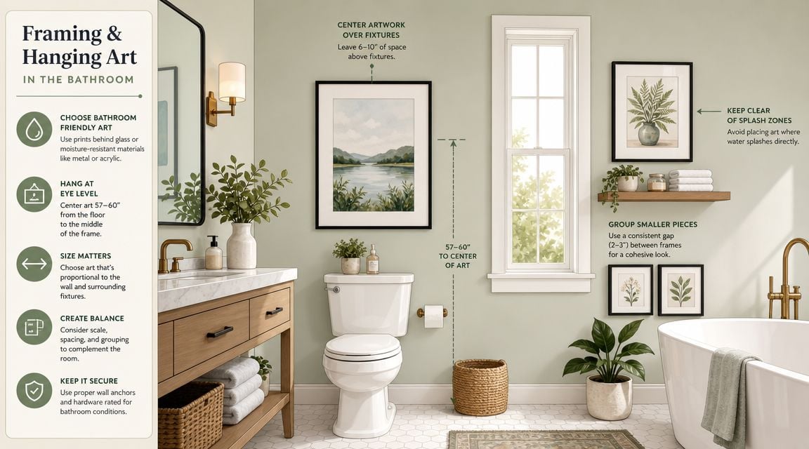
Guidance on high-humidity display conditions points to the same priorities: moisture-tolerant substrates, sealed edges, and corrosion-resistant hanging hardware, with the biggest risk often being moisture getting behind the frame rather than damage to the image on the front, as explained in this article on combining bathroom artwork and black and white wall art.
Frame choices that make sense in humid air
Not every frame belongs in a bathroom. Unsealed wood can react to humidity. Low-grade metal hardware can corrode. Thin cardboard-style backing doesn't belong anywhere near regular steam.
Better choices usually include:
- Sealed or stable frame materials that won't easily warp
- Protective glazing when paper art is used
- Fully finished backs that reduce rear moisture exposure
- Hardware designed for damp conditions rather than basic picture hooks
The goal isn't to make the piece airtight. The goal is to reduce the weak points that fail in humid air.
A simple hanging checklist
Before hanging the art, it helps to run through a short checklist.
- Check the wall location: Keep the piece farther from tubs, showers, and direct sink splash when possible.
- Inspect the back: The rear should look finished and deliberate, not open and flimsy.
- Use corrosion-resistant hardware: The fasteners matter as much as the frame.
- Leave a bit of air space: Pressing the piece tightly into a damp wall can invite trouble over time.
- Level it against the room, not just the ceiling: Bathrooms in older homes can be visually tricky.
Some homeowners are surprised to learn that hanging technique affects longevity as much as looks. A carefully placed piece with the right support will age better and stay straighter. For anyone who wants a cleaner installation, this step-by-step guide to hanging your picture with precision is a useful companion.
Your Local Partner in Home Design
The right black and white bathroom art does four jobs at once. It gives the room contrast. It supports the bathroom's overall style. It's scaled to the wall instead of the fixture alone. And it's made well enough to survive real humidity.
That practical side matters in Upstate New York homes. A powder room in Albany doesn't ask the same things of wall art as a busy full bath in Greene County. Material choice, placement, and framing all need to reflect how the room is used, not just how it looks in a photo.
For homeowners taking on a broader refresh, it often helps to think beyond the art itself. Vanities, flooring, mirrors, wall color, and storage all shape whether the room feels cohesive. Anyone preparing for a larger project can review this resource to plan your bathroom renovation before making final decor decisions.
A local design conversation can save a lot of trial and error. In the Greater Albany Capital Region, many homeowners want one place to sort through finishes, custom options, flooring coordination, and room-by-room styling without piecing it together from multiple stops. That's especially useful when a bathroom update is part of a larger home project rather than a stand-alone purchase.
Homeowners across Freehold, Albany, Schenectady, Troy, and the surrounding Capital Region can explore coordinated home decor, furniture, flooring, and design help through Tip Top Furniture & Mattresses. Since 1978, the family-owned showroom has helped local households bring projects together with personalized guidance, custom order options, design services, delivery, and flexible financing that can make a full room refresh more manageable.