10 Stunning Colors That Go With Dark Purple for Albany Homes (2026 Guide)
Dark purple, a color of royalty, creativity, and depth, can elevate any room from ordinary to extraordinary. But which colors that go with dark purple will create a balanced and beautiful space? For over 45 years, since our founding in 1978, our family-owned showroom in Freehold, NY, has helped homeowners across the Greater Albany Capital Region master their interior design challenges. This guide is your expert resource, drawing on decades of experience from our Professional Design Services (since 1984) to showcase stunning color pairings. To appreciate the richness of this hue, consider how it appears in different textures, like this luxurious neck warmer in Aubergine Dream faux fur, which demonstrates its plush, inviting quality.
We'll explore 10 palettes that work flawlessly with dark purple, offering actionable tips on how to use furniture, paint, and decor to bring these looks to life. Whether you're refreshing a bedroom in Troy, planning a living room makeover in Schenectady, or seeking the perfect Amish-made accent piece near Albany, you'll find inspiration. This article provides clear, practical advice on pairing everything from soft neutrals and metallics to bold jewel tones, ensuring you can confidently use this powerful color to create a home that truly reflects your style.
1. Dark Purple with Soft Gold Accents: Timeless Luxury
Pairing dark purple with soft, brushed gold is a classic strategy for creating a look of timeless luxury. The deep, royal nature of purple provides a rich, dramatic backdrop, while the warm metallic sheen of gold introduces light and opulence. This combination prevents a dark purple room from feeling overly somber or cold, striking a perfect balance between moody sophistication and inviting warmth. It's an ideal choice for creating an elegant atmosphere in a formal living room or a restful, high-end retreat in a master bedroom.
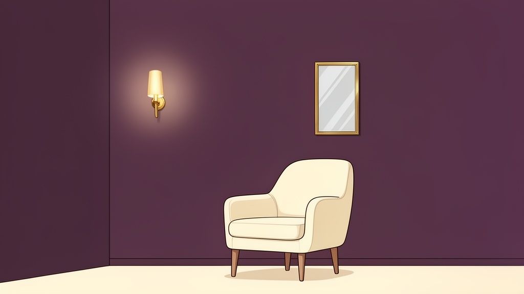
This pairing is a staple in upscale design because it confidently communicates quality and comfort. For homeowners in the Albany area looking to craft a space that feels both personal and polished, this is one of the most effective color schemes that go with dark purple.
How to Implement This Look in the Capital Region:
- Walls: Paint a single accent wall in a deep plum or aubergine behind a sofa or headboard. This creates a dramatic focal point without overwhelming the space.
- Furniture & Accents: Introduce gold through lighting fixtures, mirror frames, and cabinet hardware. At Tip Top Furniture, you can custom order furniture with your choice of hardware, ensuring a cohesive look.
- Textiles: To soften the palette, layer in textiles like cream-colored throw pillows, an ivory area rug, or beige linen curtains. This adds texture and breaks up the deep color.
Expert Tip: The finish of your gold accents matters. A soft, brushed, or satin gold offers a more modern and subtle elegance compared to a highly polished, bright gold. At Tip Top, our 45+ years of experience have shown us that getting these details right is key to a professional look.
2. Dark Purple with Cream and Ivory Neutrals: Calm Sophistication
For a palette that is both sophisticated and approachable, pairing dark purple with soft cream and ivory is a classic choice. These gentle neutrals provide a clean, warm contrast that balances the richness of a deep plum or eggplant, preventing the space from feeling too imposing. This combination creates a serene, calming atmosphere, making it a perfect fit for bedrooms, nurseries, or living areas where comfort and understated elegance are the primary goals.
This color scheme is particularly effective in modern farmhouse and transitional interiors, where it bridges the gap between traditional comfort and clean, modern lines. For homeowners in Greene County and the surrounding Capital Region looking for colors that go with dark purple to create a tranquil retreat, this pairing offers a soft, inviting solution that feels both timeless and fresh.
How to Implement This Look in the Capital Region:
- Walls: Keep the room feeling bright and open by using cream or ivory on the main walls and reserving dark purple for a single accent wall.
- Furniture & Accents: Anchor the room with substantial, light-colored furniture. At Tip Top Furniture, you can custom order upholstered pieces like sofas and armchairs in a wide range of cream and ivory fabrics to get the exact look you want.
- Textiles: Build depth by layering various neutral tones. Combine cream, ivory, linen, and soft taupe through throw blankets, pillows, and area rugs. Natural wood finishes from our Amish-made furniture collection will ground the palette beautifully.
Expert Tip: To avoid a flat look, use a variety of cream shades (ecru, off-white, linen) and textures. The interplay between different textiles like soft wool, crisp cotton, and nubby linen adds visual interest and a cozy, touchable quality to the room.
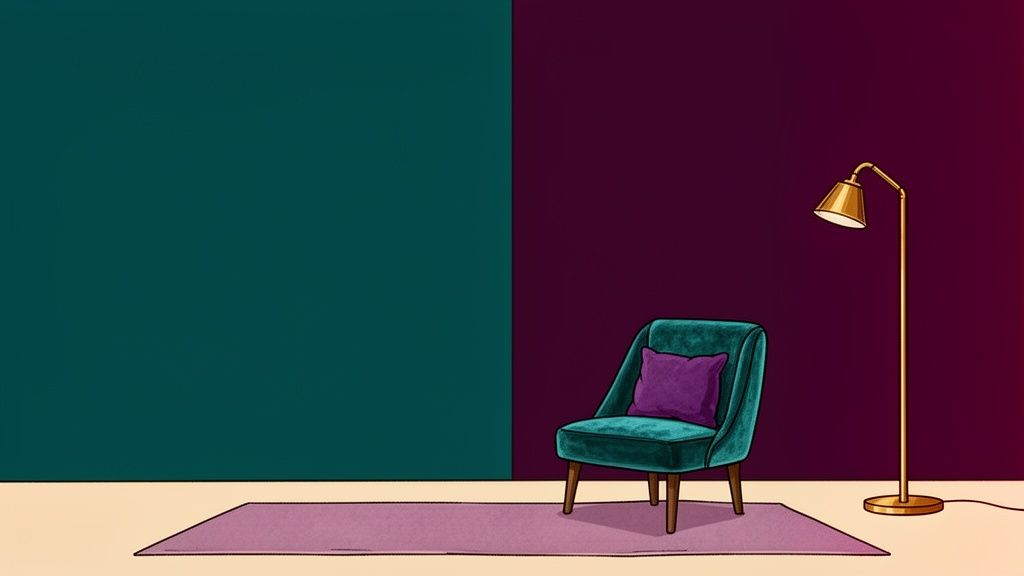
3. Dark Purple with Deep Teal or Jewel Tones: Moody and Dramatic
For a truly immersive and dramatic interior, pairing dark purple with other rich jewel tones like deep teal, emerald green, or sapphire blue creates a luxurious, deeply saturated effect. Unlike palettes that use a light color for contrast, this combination embraces a moody, cohesive atmosphere where both colors carry equal weight. It’s a bold choice that speaks to personality and depth, making it exceptionally well-suited for spaces designed for focus or intimate conversation, like a home office, library, or a statement dining room.
This look, often seen in high-end design publications like Architectural Digest, is perfect for homeowners in the Capital Region who aren't afraid of color and want to create a room with a distinct, memorable character. The key is balancing these intense colors to maintain sophistication.
How to Implement This Look in the Capital Region:
- Walls: Consider using dark purple on the main walls and introducing a deep teal or emerald green on a single, impactful accent wall, such as behind a bookshelf or a credenza.
- Furniture & Accents: Ground the rich colors with natural wood furniture, like a solid oak desk or a walnut dining set. Incorporate pops of light with warm brass or gold fixtures and mirror frames to prevent the space from feeling too dark.
- Textiles: Layer in patterned textiles that feature both purple and your chosen jewel tone. A velvet armchair in sapphire blue or an area rug with an emerald and plum design can tie the entire room together beautifully.
Expert Tip: A bold, multi-toned palette requires careful planning to feel cohesive rather than chaotic. Getting the balance right is crucial. For expert guidance, book a complimentary design consultation at our Freehold showroom—our team has been providing Professional Design Services since 1984.
4. Dark Purple with Soft Blush Pink and Rose Gold
A romantic and distinctly contemporary palette, this combination brings together the depth of dark purple with the gentle softness of blush pink. The addition of rose gold metallics injects a modern, polished elegance that ties the two colors together. This pairing masterfully balances the moody intensity of purple with the light, feminine warmth of blush, creating a space that feels both sophisticated and inviting. It's an excellent choice for bedrooms or any space intended to feel like a sanctuary with a touch of modern romance.
This color scheme has become a favorite in contemporary design, especially for homeowners in the Capital Region looking to create a stylish yet personal retreat. The blend of colors feels current and fashionable, making it one of the most popular color schemes that go with dark purple for an updated, chic look.
How to Implement This Look in the Capital Region:
- Walls: Use a deep, rich purple as a dramatic base for the room or on an accent wall. Lighter blush pink can be used in adjacent nooks or on smaller accent walls to create contrast.
- Furniture & Accents: Introduce rose gold through lighting fixtures, mirror frames, and decorative objects. At Tip Top Furniture, you can custom order upholstered pieces like an armchair or headboard in blush-toned fabrics to complete the aesthetic.
- Textiles: Layer with cream and ivory textiles, such as a plush white area rug or sheer curtains, to keep the palette feeling fresh and airy. Geometric or floral patterns that incorporate both purple and pink can add visual interest.
Expert Tip: To ground this soft and romantic palette, incorporate natural wood elements. A nightstand or dresser in a warm wood tone, like those found in our Amish furniture collection, can add a balancing touch of organic texture, preventing the design from feeling overly sweet.
5. Dark Purple with Warm Gray and Charcoal: Contemporary Sophistication
For a modern, sophisticated palette, combining dark purple with warm gray and charcoal creates an atmosphere of grounded elegance. The grays serve as a calming neutral buffer, allowing the boldness of the purple to shine without overwhelming the senses. Charcoal adds depth and a touch of drama, resulting in a versatile color scheme that feels both current and enduring. This combination is especially effective in modern living rooms, home offices, and transitional bedrooms where stylish functionality is key.
This trio is a favorite among contemporary designers because it masterfully balances color with neutral tones. For homeowners in the Albany Capital Region aiming for a chic and professional look, this is one of the most effective color schemes that go with dark purple, offering a polished yet comfortable feel.
How to Implement This Look in the Capital Region:
- Walls: Choose a dark purple for one accent wall or for a smaller space like a home office nook to create a strong focal point. Use a warm, light gray on the remaining walls to keep the room bright.
- Furniture & Accents: Anchor the room with a substantial piece of furniture in charcoal, like a sofa or media console. At Tip Top Furniture, you can find the perfect shade by exploring our custom order options, allowing you to select the ideal gray upholstery for your space.
- Textiles: Layer in multiple shades of gray through textiles. Think charcoal throw blankets, light gray pillows, and area rugs that weave together purple, gray, and charcoal patterns. Add touches of cream or white to introduce brightness.
Expert Tip: The temperature of your gray is critical. Always select warm grays with subtle beige or taupe undertones to complement the rich warmth of dark purple. Cool, blue-based grays can clash and make the space feel chilly and uninviting.
6. Dark Purple with Black and White Classic Contrast
For a truly dramatic and modern aesthetic, pairing dark purple with the classic high contrast of black and white is a bold choice. This palette creates a striking, graphic look that feels both daring and sophisticated. The deep, rich quality of dark purple is grounded by the starkness of black, while crisp white provides essential visual breathing room, preventing the combination from feeling too heavy or enclosed. It’s an ideal choice for modern, eclectic, or artistic spaces where you want the design itself to make a powerful statement.
This bold combination is perfect for homeowners in the Capital Region who aren't afraid of color and want to create a space with a strong personality. From an eclectic bedroom in Schenectady to an artistic home office in Troy, this palette is one of the most impactful color schemes that go with dark purple for expressing a confident, creative style.
How to Implement This Look in the Capital Region:
- Walls: Use a rich aubergine or plum on a single accent wall to serve as the main color. Keep the remaining walls and trim bright white to balance the darkness and keep the room feeling open.
- Furniture & Accents: Introduce black through key furniture pieces. At Tip Top Furniture, you can custom order a sofa or armchair in a black fabric to anchor your living room. Alternatively, use smaller black accents like picture frames or a sleek coffee table.
- Textiles: Incorporate black and white patterns to add visual interest and break up the solid colors. Think geometric-print throw pillows, a striped area rug, or patterned bedding. Many of these items are readily available in our Clearance Corner for an immediate style upgrade.
Expert Tip: Texture is crucial in a black-and-white scheme to prevent it from feeling flat. Layer different materials like a velvet purple chair, a glossy black table, and a chunky white knit throw to create depth and a more inviting atmosphere.
7. Dark Purple with Soft Lavender and White Layering
This ethereal and soothing palette combines dark purple with soft lavender and white, creating a monochromatic approach with tonal depth. Instead of contrasting, this pairing uses multiple values of purple, from deep to light, to build a cohesive and calming environment. The white elements act as a clean, bright counterpoint, preventing the purples from becoming overwhelming and adding a necessary crispness. This is a wonderful choice for bedrooms, nurseries, or any space intended for relaxation and tranquility.
The beauty of this combination is its ability to be both visually interesting and deeply restful. For homeowners in the Albany area aiming to design a true sleep sanctuary, this is one of the most effective color schemes that go with dark purple. It feels sophisticated yet gentle, making it a favorite in modern wellness and hospitality design.
How to Implement This Look in the Capital Region:
- Walls: Use a rich, dark purple on a single accent wall behind the bed to create a focal point. Paint the remaining walls a soft, airy lavender to keep the room feeling open and light.
- Textiles: Layer textiles in varying shades. Start with dark purple decorative pillows, add a medium-toned lavender throw blanket, and use crisp white bedding as the base. Tip Top Furniture offers an incredible selection of USA-made mattresses and bedding to complete your sleep sanctuary.
- Furniture & Trim: Bright white trim and furniture will pop against the purple hues, adding a clean, sharp look. Alternatively, warm wood furniture can be used to add natural warmth and prevent the cool-toned palette from feeling sterile.
Expert Tip: Texture is crucial in a monochromatic scheme. Combine different materials like plush velvet, soft linen, and chunky knits to add dimension. When you visit our Freehold, NY showroom, our team can help you select fabrics and finishes that create a rich, layered look, and you can even custom order pieces to perfectly match your vision.
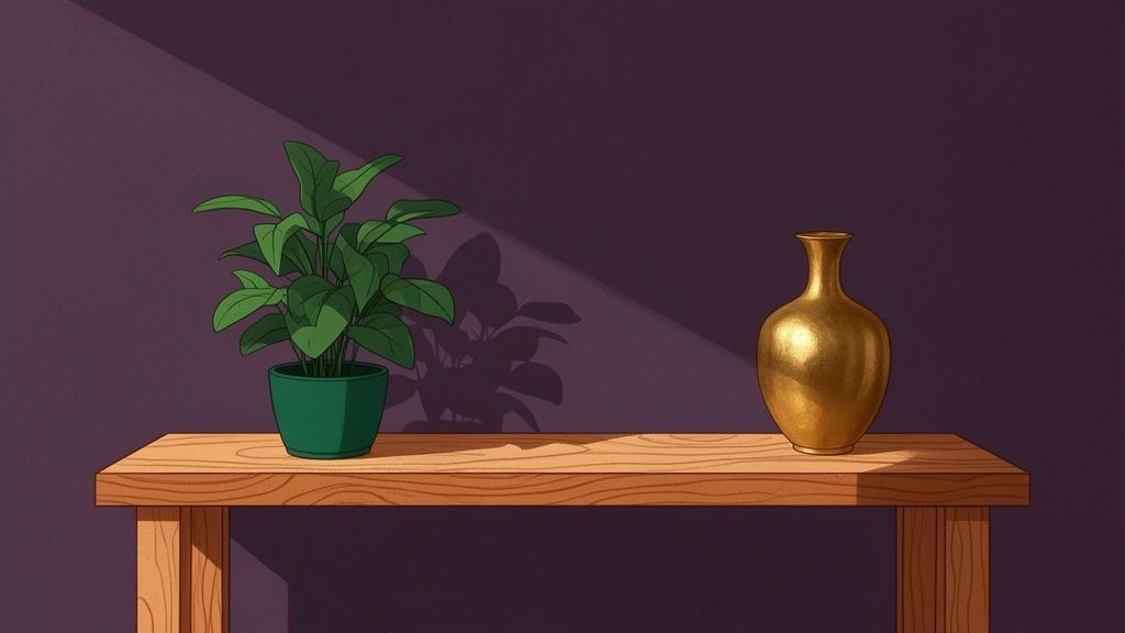
8. Dark Purple with Emerald Green and Natural Wood: Organic Sophistication
This nature-inspired palette combines deep, moody purple with rich emerald green and the inherent warmth of natural wood, creating an organic yet refined aesthetic. The combination pulls from jewel-toned florals and lush forests, where deep purples and greens naturally coexist. Grounding this vibrant pairing, natural wood adds an essential layer of warmth and texture, preventing the saturated colors from feeling overwhelming and creating a sense of balanced, earthy luxury. It’s an excellent choice for a botanical dining room, an eclectic living room, or a home office celebrating natural materials.
This pairing is a favorite in bohemian, eclectic, and contemporary farmhouse designs because it feels both adventurous and grounded. For homeowners in Greene County and the greater Capital Region looking for colors that go with dark purple, this combination offers a unique way to bring the beauty of nature indoors with a sophisticated twist.
How to Implement This Look in the Capital Region:
- Foundation: Use natural wood as the foundational element through furniture, flooring, or ceiling beams. At Tip Top Furniture, our Amish furniture collection offers heirloom-quality, solid wood pieces that serve as the perfect base.
- Color Accents: Introduce dark purple and emerald green through accent walls, velvet upholstery, or statement decor pieces. Avoid splitting the room 50/50; let one color be slightly more dominant than the other.
- Textiles & Texture: Layer in natural fibers like jute, wool, and linen through area rugs, curtains, and throw pillows to enhance the organic feel. Incorporate textiles that feature botanical patterns combining purple, green, and cream.
Expert Tip: To ensure the space feels cohesive and not chaotic, use a neutral like warm white or cream on the main walls. This acts as a visual break between the saturated colors and allows the purple, green, and wood tones to truly stand out.
9. Dark Purple with Burnt Orange and Copper Metallics
For a rich, autumnal aesthetic that feels both cozy and contemporary, pair dark purple with burnt orange and warm copper metallics. This palette creates a warm, earthy atmosphere reminiscent of a fall sunset. The deep, grounding quality of purple anchors the look, while the vibrant energy of burnt orange adds a complementary spark. Copper serves as the perfect metallic bridge, its reddish undertones connecting the two colors and adding a touch of modern warmth. This scheme is an excellent choice for creating inviting social spaces like dining rooms or family rooms.
This combination is favored in modern bohemian and eclectic design for its ability to create a space that feels curated, warm, and full of personality. For families in Upstate New York looking to design a cozy yet sophisticated gathering spot, this is one of the most effective color schemes that go with dark purple.
How to Implement This Look in the Capital Region:
- Balance: Use dark purple and burnt orange in relatively equal measures to create a balanced, dynamic look. This could be a purple accent wall with a prominent burnt orange sofa or armchair.
- Metallics: Integrate copper through light fixtures, cabinet hardware, and decorative objects like vases or bowls. At Tip Top Furniture, you can custom order dining and living room pieces with your choice of hardware to achieve this cohesive style.
- Textiles: Layering is key. Incorporate textiles in purple, burnt orange, and neutral creams to add depth. Patterned rugs that feature both colors can tie the entire room together. You can explore how textiles complete a room by checking out our guide on adding warmth with burnt orange curtains.
Expert Tip: To enhance the autumnal feel, select furniture in warm wood tones. Woods like cherry, oak, or walnut complement the orange and purple hues perfectly and add a natural, organic element to the space. Combining these woods with leather accents can create an exceptionally rich and textured environment.
10. Dark Purple with Deep Navy Blue and Brass Accents
This elegant, nautical-inspired palette pairs the richness of dark purple with the depth of navy blue, creating a sophisticated and moody atmosphere. The addition of warm brass accents cuts through the deep jewel tones, introducing a layer of metallic warmth and luxury. This trio strikes a beautiful balance between traditional maritime influences and timeless, upscale design, making it a compelling choice among colors that go with dark purple. It’s perfect for creating a stately yet comfortable feeling in a bedroom, living room, or home office.
The combination of two deep, cool colors with a warm metal creates a balanced and luxurious environment. This palette is well-suited for traditional, transitional, and even coastal-inspired homes looking for a more serious and refined aesthetic. For homeowners in Greene County and the greater Capital Region, this is a fantastic way to build a room that feels both classic and curated.
How to Implement This Look in the Capital Region:
- Balance with Neutrals: To prevent the space from feeling too heavy, use cream or ivory on the walls or for large upholstery pieces. Bright white trim and architectural details will also add crispness and light.
- Introduce Brass: Incorporate brass through essential elements like light fixtures, cabinet hardware, and decorative accessories such as trays or vases. This warm metallic will stand out against the deep purple and navy.
- Furniture & Textiles: Consider a statement piece like a deep purple sofa or a navy blue armchair, available through Tip Top Furniture’s custom order program. Layer in textiles with stripes or geometric patterns that feature both colors to tie the room together.
Expert Tip: The key to making this dark palette work is excellent lighting. Ensure the room is well-lit with multiple light sources, all finished in a warm brass. This not only provides necessary brightness but also reinforces the color scheme, making the space feel intentional and inviting.
Your Guide to Dark Purple Color Pairings for Albany & the Capital Region
| Palette | 🔄 Complexity | ⚡ Resources & Effort | ⭐ Expected Outcome | 📊 Ideal Use Cases | 💡 Key Advantages / Tips |
|---|---|---|---|---|---|
| Dark Purple with Soft Gold Accents | Medium — needs careful balance and lighting | Gold fixtures, upgraded lighting, accent furniture; moderate cost | Luxurious, refined, formal (⭐⭐⭐) | Formal living, dining rooms, master bedrooms | Use as an accent wall, layer cream textiles, ensure warm lighting; consider pro design |
| Dark Purple with Cream and Ivory Neutrals | Low — straightforward to implement | Paint and textiles; budget-friendly | Calming, approachable, versatile (⭐⭐) | Bedrooms, nurseries, family living spaces | Accent wall + layered creams; add patterns and natural wood for depth |
| Dark Purple with Deep Teal or Jewel Tones | High — bold pairing requires balance and light | Multiple rich paints, quality lighting, possible pro guidance; higher cost | Dramatic, immersive, memorable (⭐⭐⭐) | Home offices, libraries, statement dining rooms | Balance with cream or gold, ensure ample lighting, use patterned textiles |
| Dark Purple with Soft Blush Pink and Rose Gold | Medium — trend-forward but manageable | Rose gold fixtures, blush textiles; moderate cost | Romantic, contemporary, warm (⭐⭐) | Bedrooms, master suites, young-professional spaces | Use purple base with blush accents, add greenery; note trend longevity |
| Dark Purple with Warm Gray and Charcoal | Low–Medium — simple but needs layered values | Multiple gray paints, layered textiles, warm wood or metallic accents | Contemporary, versatile, understated (⭐⭐) | Living rooms, home offices, transitional bedrooms | Choose warm grays, layer shades, add warm wood or brass to prevent coolness |
| Dark Purple with Black and White Classic Contrast | Medium — high-contrast design needs careful proportioning | High-contrast textiles, paint, good lighting; easy to update with decor | Bold, graphic, statement-making (⭐⭐) | Eclectic/modern bedrooms, living rooms, creative offices | Use balanced black/white proportions, add metallics and texture to soften harshness |
| Dark Purple with Soft Lavender and White Layering | Low — monochromatic approach is easy to coordinate | Multiple purple shades, bedding and textiles; minimal extra cost | Soothing, cohesive, calming (⭐⭐) | Bedrooms, nurseries, spas, relaxation spaces | Layer tonal textiles, add white trim and warm wood to avoid feeling cool or monotonous |
| Dark Purple with Emerald Green and Natural Wood | Medium–High — multiple saturated colors need coordination | Natural wood furniture, plants, quality finishes; design expertise advised | Organic, sophisticated, nature-forward (⭐⭐⭐) | Living rooms, dining rooms, bohemian/eclectic spaces | Use wood as the neutral base, incorporate botanical elements, use cream transitions |
| Dark Purple with Burnt Orange and Copper Metallics | Medium — warm, layered scheme requiring balance | Copper fixtures, warm wood furniture, textiles; moderate cost | Warm, inviting, autumnal (⭐⭐) | Dining rooms, living rooms, gathering spaces | Use equal proportions of purple and burnt orange, warm lighting, layer neutrals to balance |
| Dark Purple with Deep Navy Blue and Brass Accents | Medium–High — two deep tones demand strong contrast controls | Brass fixtures, quality upholstery, layered lighting; moderate to high cost | Sophisticated, refined, nautical-influenced (⭐⭐⭐) | Bedrooms, living rooms, traditional or transitional spaces | Balance with cream/ivory, white trim and warm wood; ensure excellent warm lighting |
Bring Your Perfect Purple Palette to Life in Freehold, NY
You’ve journeyed through a spectrum of possibilities, discovering the many stunning colors that go with dark purple. From the regal pairing with soft gold to the bold statement made with emerald green, the right color combination can completely change the atmosphere of your home. This exploration proves that dark purple is not a limiting color but a launchpad for incredible interior design.
The key takeaway is that dark purple offers remarkable versatility. Whether you're aiming for a luxurious and opulent bedroom, a soothing and sophisticated home office, or a dramatic and welcoming living room, there is a palette that fits. You can create balance with soft neutrals like cream, generate energy with contrasting burnt orange, or build a layered, monochromatic look with soft lavenders.
Mastering Your Dark Purple Palette
Understanding these color pairings is the first crucial step. The next is bringing that vision from the page into your home. Here’s how our trusted, local experts can help you move forward:
- Trust Your Instincts: While we’ve provided ten proven combinations, the best choice is the one that resonates with you personally. Think about the mood you want to create. Do you want your space to feel calming, energizing, formal, or cozy?
- Start with a Foundation: Your largest furniture pieces, like a sofa or bed, will anchor your color scheme. For example, a charcoal gray sofa from our living room collection provides a perfect neutral base for dark purple walls and blush pink accents.
- Layer with Confidence: Use the 60-30-10 rule as a guide. Your dominant color (perhaps a neutral) takes up 60% of the space, your secondary color (like dark purple) takes 30%, and your accent color (such as soft gold) fills the final 10%.
Choosing the right colors is about more than just aesthetics; it's about creating a home that feels uniquely yours. It’s about building a space where you can relax, entertain, and live comfortably. A well-designed room improves your daily life, and a thoughtful color palette is the foundation of that design. A project like this can feel big, but our flexible financing options make it simple and affordable.
At Tip Top Furniture & Mattresses, we believe that great design should be accessible to everyone in our community, from Albany to the surrounding Capital Region. Since 1978, our family has helped neighbors in Greene County and beyond find pieces that last a lifetime. With our extensive selection of American-made and Amish handcrafted furniture, you can find the exact items to complete your dark purple-inspired vision. Let us help you find the perfect pieces to turn your color dreams into a beautiful reality.
Ready to build your dream space around your favorite dark purple palette? Visit the Tip Top Furniture & Mattresses showroom in Freehold, NY, to see how our quality furniture and expert design services can bring your vision to life. Let our family help yours create a home you’ll love for years to come.