
Earth Tone Color Palette: Warm Design Tips for 2026


Standing in a paint aisle in Freehold or anywhere across the Capital Region, it's easy to get stuck between five versions of beige and a handful of muted greens that all look almost right. That's exactly where an earth tone color palette earns its keep. Used well, it gives a room warmth, grounding, and a sense of permanence that fits Upstate New York homes through long winters, bright summer light, and everything in between.
The mistake is treating earth tones like a safe default. They're not. They're a design language with deep roots, from prehistoric ochre pigments used about 75,000 years ago at Blombos Cave in South Africa to the 1970s and early 1980s palette that showed up in appliances, interiors, and furniture, especially in colors like harvest gold, avocado green, burnt orange, chocolate brown, and rust. Those colors still matter because they tell homeowners what earth tones do best, they create a room that feels settled without feeling cold or synthetic.
Why Earth Tones Feel Like Home
A homeowner walks into the showroom with a wall swatch in one hand and a flooring sample in the other, then realizes both look good until they're placed side by side. That's why earth tones can be so useful. They don't fight the room, they work with it, especially when the house needs warmth without looking overdone.
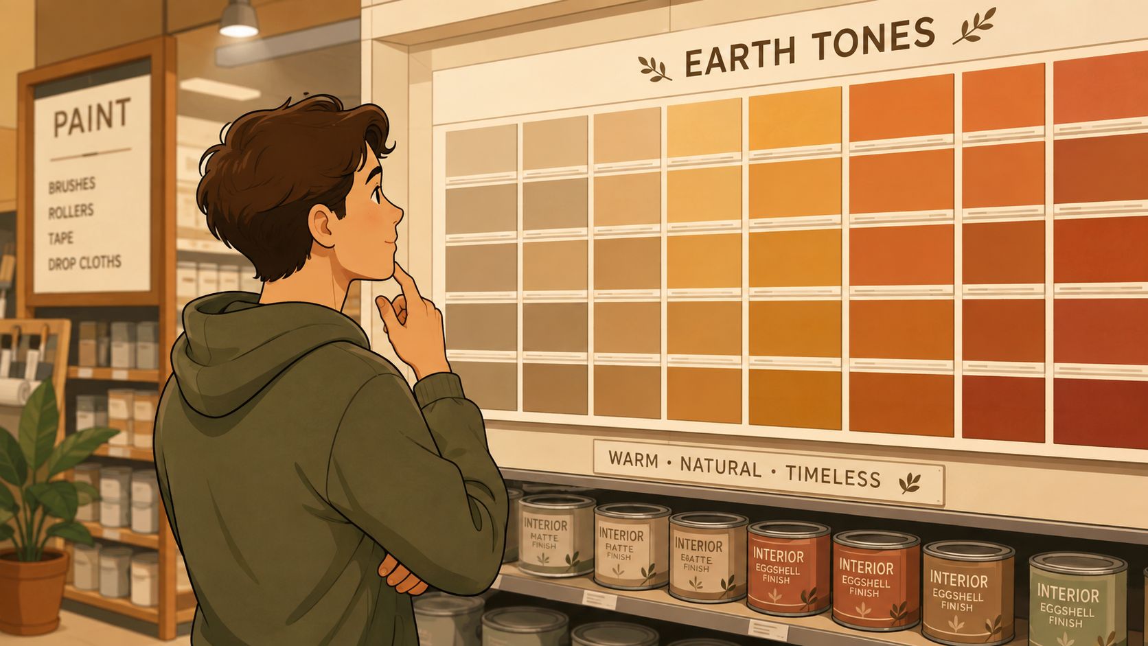
Earth tones have authority because they're older than trend cycles. The pigment family behind them includes ochre, umber, and sienna, materials drawn from clay, soil, and mineral deposits and used for thousands of years in art and architecture. A modern interior doesn't need that whole history on the wall, but it does benefit from the sense that these colors aren't artificial or flimsy. For homeowners planning a living room, bedroom, or dining area, that grounding quality matters more than chasing the latest bright trend. Natural materials and earthy finishes fit that same logic because they reinforce the room's texture and visual calm.
Why they work so well in Upstate New York homes
Natural light changes fast in this region. A palette that looks soft in morning sun can turn flat by late afternoon if it lacks depth. Earth tones solve that better than many cool neutrals because they carry warmth even when the sky goes gray.
Practical rule: if a room already gets a lot of wood, stone, or sun-faded light, earth tones should add structure, not just color.
That's why these palettes keep coming back in furniture, flooring, and decor. They pair naturally with solid wood, woven fibers, matte finishes, and fabrics that don't glare under interior lighting. A homeowner looking for a room that feels collected, not staged, should start here.
Understanding the Earth Tone Color Family
An earth tone is not just “brown.” It's a color with brown pigment mixed in, and interior guidance usually groups the family into two temperature zones. Warm earth tones include terracotta, rust, cognac, ochre, mustard, camel, burnt orange, dusty pink, oxblood, and brick. Cool earth tones include sage, olive, evergreen, charcoal, pine, dusty blue, taupe, and greige. For a room that needs cohesion, that split is more useful than vague labels like natural or rustic. A complete color-palette guide helps when a room has to balance wall color, upholstery, and flooring together.
The rule that keeps a palette from turning muddy
Earth tones read as earthy because they're muted and have lower saturation. They also tend to sit in a medium-low lightness range, which keeps them calm instead of flashy. That's why the family can include browns, tans, umbers, brick reds, terracotta, yellow ochre, warm grays, moss and tree greens, brown oranges, burnt sienna, whites, and some red-browns and gray-blues without losing its identity.
A shopper who wants the room to feel current should look for that muted quality first, then make sure the finish isn't dead flat. A little variation in sheen, weave, or grain helps a lot. The point is not to collect every earthy color in the store, it's to choose shades that share a subdued visual temperature.
A cleaner way to choose furniture and fabric colors
Think in families, not random swatches.
- Warm family picks: terracotta, rust, camel, ochre, mustard, and burnt orange work best when a room needs energy.
- Cool family picks: sage, olive, taupe, greige, dusty blue, and charcoal settle a room down.
- Deeper anchors: walnut, espresso, umber, and rust help a palette feel finished instead of airy and unfinished.
For fabric ideas that sit comfortably in that space, mink sofa cover ideas show how a soft neutral can still feel grounded when it's paired with stronger accents. That's the right mindset for earth tones in a real home, one base tone, one supporting tone, and one anchor that keeps the room from drifting into beige sameness.
A useful design reference also groups earth tones into six tonal families, each with four to six tones. Those families are Terracotta + Clay, Ochre + Mustard, Olive + Moss, Rust + Cinnamon, Sand + Stone, and Walnut + Espresso. The smart move is to pick one family and work within it instead of mixing unrelated shades that only look earthy in isolation.
Four Curated Earth Tone Palettes for Every Mood
The right earth tone color palette depends on the room's job. A small upstairs bedroom shouldn't use the same balance as a dining room that's meant to feel moody at night. The most useful palettes have a light base, a mid-tone, a support color, and a dark anchor, because that structure gives the room direction. Living room color palette ideas are especially helpful when the sofa, rug, and wall color all need to agree fast.
| Palette Name | Light Base | Mid-Tone | Support Color | Dark Anchor | Best For |
|---|---|---|---|---|---|
| Soft Sand and Moss | #FAEDCD | #D4A373 | #606C38 | #283618 | Small rooms, north-facing spaces, bedrooms that need light |
| Warm Clay and Walnut | Light cream | Clay tan | Muted green | Deep walnut | Living rooms, family spaces, gathering areas |
| Rust and Espresso | Soft beige | Rust brown | Olive or charcoal | Espresso | Dining rooms, home offices, rooms that need drama |
| Sage, Stone, and Terracotta | Warm off-white | Terracotta | Sage green | Stone brown | Bedrooms, baths, and calm transitional spaces |
Which palette does what
Soft Sand and Moss works when the room feels dark or visually cramped. The light base keeps walls open, while the dark anchor stops everything from floating. Pair it with light oak, woven textures, and a sofa in linen or performance fabric.
Warm Clay and Walnut is the safest bet for a family room. It carries enough heat for a sofa-and-rug setup, and it looks especially strong with walnut or espresso furniture, leather accents, and medium-toned flooring.
Rust and Espresso belongs in rooms that need more character. A dining room or home office can handle that depth, especially when the room has a solid wood table, darker case goods, and a rug with visible texture.
Sage, Stone, and Terracotta is the easiest palette to live with in bedrooms and baths. It stays calm, feels organic, and works best with soft wool, brushed cotton, and lighter wood finishes. A homeowner who wants the room to feel edited rather than decorated should start with this scheme.
A strong palette usually has one color that recedes, one that carries the room, and one that grounds it. If every shade competes for attention, the room loses shape fast.
Room-by-Room Application and Pairing Guide
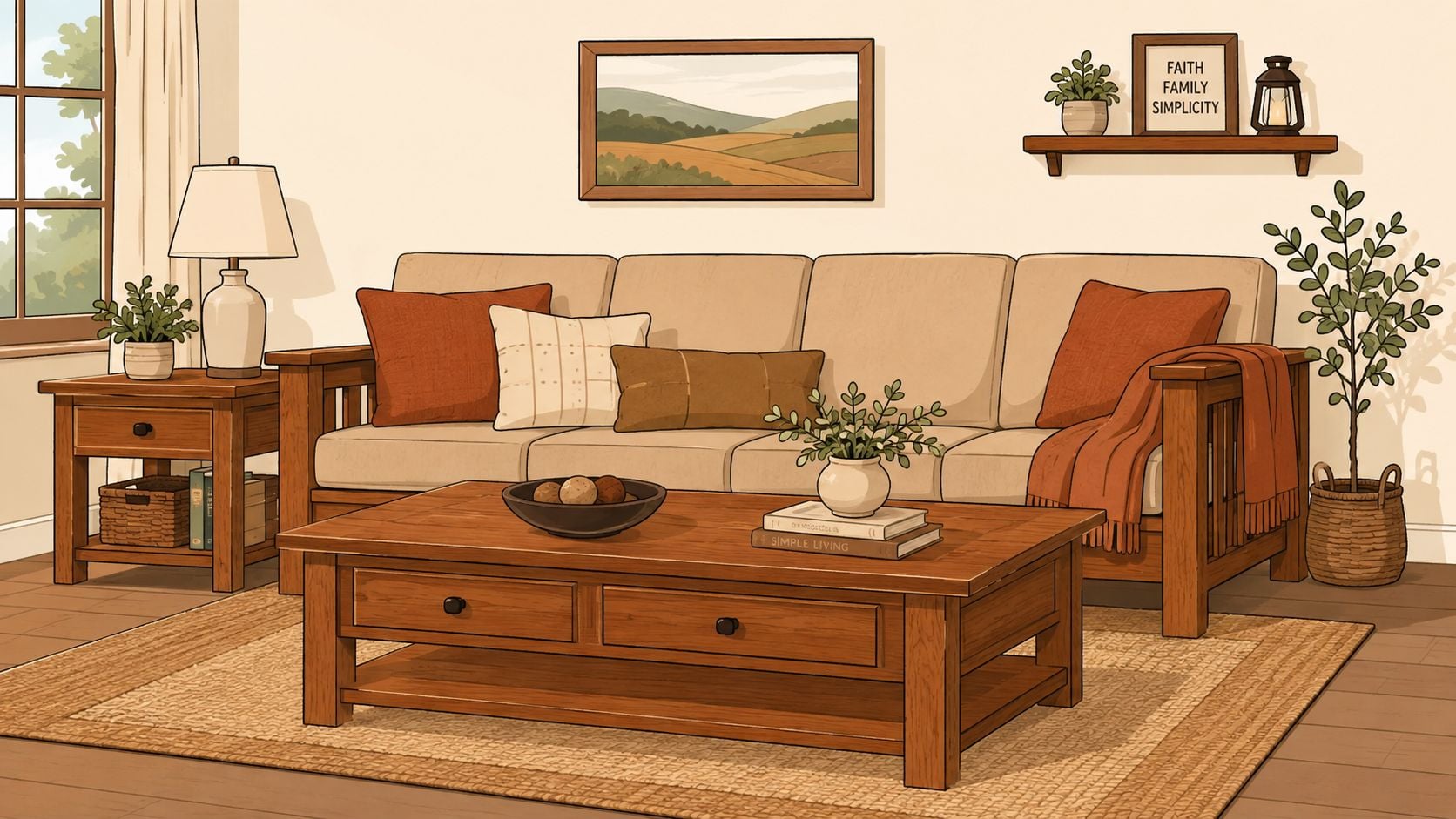
Start with the room that has the most visual pressure. In a Freehold or Albany-area home, that is usually the living room, and it needs a walnut, espresso, or deep oak anchor with a sofa in linen, leather, or a textured woven fabric. Keep the rug quieter than the upholstery, and choose a coffee table with real wood grain instead of a glossy surface. Richmond hardwood refinishing color trends show the same principle at floor level, deeper tones support moody walls without letting the room blur together.
Best pairing by room
- Living rooms: use the warmer palettes, then add one dark piece of furniture so the space doesn't wash out.
- Bedrooms: use sage, stone, and lighter wood finishes, then bring in wool, cotton, and soft bedding layers.
- Dining rooms: go deeper with terracotta or rust on the walls, then place a solid wood table underneath for visual weight. For more dining room wall color ideas, use a darker wall when the room needs more shape and a quieter palette when the furniture already carries enough presence. dining room wall color ideas
- Home offices: choose a restrained palette with charcoal, olive, or espresso so the room feels focused, not busy.
Bedroom work should stay quieter than the living room. A lighter oak bed frame, a soft rug, and muted bedding create a restful base, while a small dose of terracotta or dusty blue keeps the room from feeling flat. If you are comparing wood tones and painted finishes, the bedroom collection at Tip Top Furniture & Mattresses fits into that planning process because the finish on the frame matters as much as the wall color.
Dining rooms can handle the strongest walls in the house. Rich terracotta or a deep rust tone gives the space a grounded, intimate feel, especially with a solid wood table and chairs that show real joinery and grain. If the room gets limited daylight, use lighter textiles or a pale rug so the space does not close in after sunset.
Lighting changes everything. In Upstate New York homes, cooler daylight can make earth tones look softer than expected, while a warm bulb can push them toward richer brown or orange. The cleanest result usually comes from a balanced light source that keeps the color readable, not oversaturated.
A practical finish rule works every time. Match deeper walls with lighter textiles, then use one darker object, a table, frame, or cabinet, to keep the room anchored. That one move keeps the palette from drifting into beige fog.
Avoiding the Biggest Earth Tone Mistakes
The biggest failure with earth tones is low contrast. When walls, upholstery, rugs, and wood finishes all sit at the same value, the room goes flat fast. That's when homeowners say the space feels dated or overly beige, even if every individual piece looks fine on its own.
The two fixes that actually matter
Value contrast is essential. A very light cream beside a very dark brown creates shape and hierarchy, which keeps the room readable from across the room. Without that contrast, even good furniture can disappear into the background.
Texture contrast is the second half of the equation. Leather, linen, rattan, wool, jute, and velvet keep an earth-tone room alive even when the palette stays narrow. A smooth sofa, a nubby rug, and a wood table with visible grain will always look richer than three matte surfaces in nearly the same color.
Practical rule: if the wall color is light, at least one major piece should be meaningfully darker. If the furniture is all medium-toned, the room needs a brighter textile or a lighter rug to break it up.
A few direct dos and don'ts make this easier.
- Do layer different textures in similar tones. A camel sofa, woven pillows, and a wool throw create depth without clutter.
- Don't rely on only matte finishes. Flat-on-flat surfaces kill energy.
- Do use one high-contrast anchor. A dark wood table against light walls gives the room a spine.
- Don't let every piece blend into the wall color. Matching too closely makes the whole room feel unfinished.
The best earth-tone rooms look intentional because they have tension in the right places. Not visual noise, tension. That's the difference between a room that feels designed and one that just happened to collect neutral furniture over time.
Bringing Your Earth Tone Vision to Life
A strong palette is only useful if the furniture, flooring, and accessories can support it. That's where the Freehold showroom matters, because Tip Top Furniture & Mattresses has the room-by-room pieces, custom order options, flooring help, and professional design services needed to turn color ideas into an actual plan. Its interior design consultation services are a practical next step for homeowners who want a coordinated result without guessing at finish combinations.
A few homes need a custom wood tone. Others need a mattress, a rug, and a new dresser that all sit in the same visual family. Jessie's Home wall art collection can help finish the room once the main furniture and flooring are set, because art should support the palette, not compete with it.
For shoppers who want value without starting over, the Clearance Corner and flexible financing make a whole-room project more realistic. That matters in real homes, where a color refresh usually turns into a sofa decision, then a floor decision, then a lighting decision. Visit the showroom, use the room planner, and choose the pieces that give the palette structure instead of just matching the paint chip.