Colors Dining Room Walls: Mood, Light, and Style with Tip Top Furniture in Freehold, NY
Need a fast pick for colors dining room walls? With over 45 years of family-owned expertise (since 1978) and Professional Design Services offered since 1984, Tip Top Furniture & Mattresses in Freehold, NY, guides Albany and Capital Region homeowners through Moody Jewel Tones, Warm Neutrals, or Bright Accent Shades tailored to your room’s size, natural light, and style goals. Start here before diving into detailed tips.
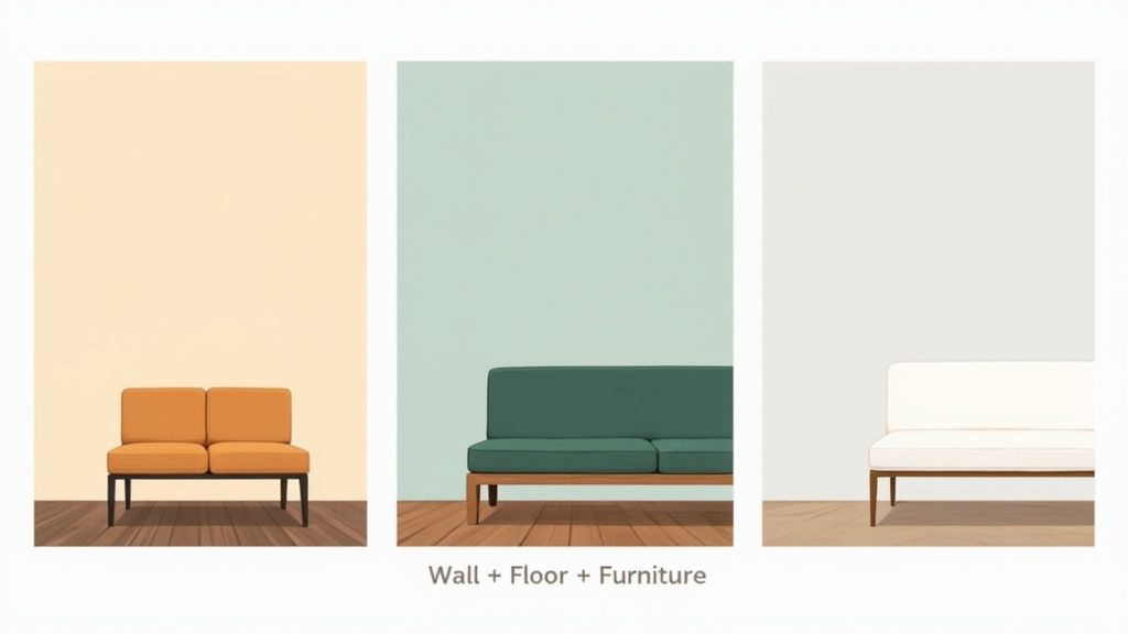
Compare Top Wall Color Approaches
Here’s a quick side-by-side look at the three main strategies to transform your dining space:
Top Wall Color Approaches at a Glance
| Approach | Mood Impact | Best Conditions |
|---|---|---|
| Moody Jewel Tones | Adds depth and drama | Large, well-lit rooms |
| Warm Neutrals | Creates a cozy vibe | Compact or low-light spaces |
| Bright Accent Shades | Brings in energy | Accent walls or breakfast nooks |
Use this snapshot to see which tone aligns with your vision and your dining area.
Tip Top Resources
- Start with our Free Online Room Planner to visualize colors paired with Amish furniture and flooring.
- Sample paint swatches and review USA-made mattress options in our Freehold, NY showroom.
- Explore flexible financing plans on our Financing page for paint, furniture, and decor.
- Order customized palettes and finishes via Tip Top Custom Orders for a personalized touch.
- Browse curated bedroom looks in our Bedroom Furniture section and living spaces in Living Room Furniture.
- Check out deep discounts in our Clearance section.
The decision tree infographic below maps out these three strategic color approaches based on room size and light.
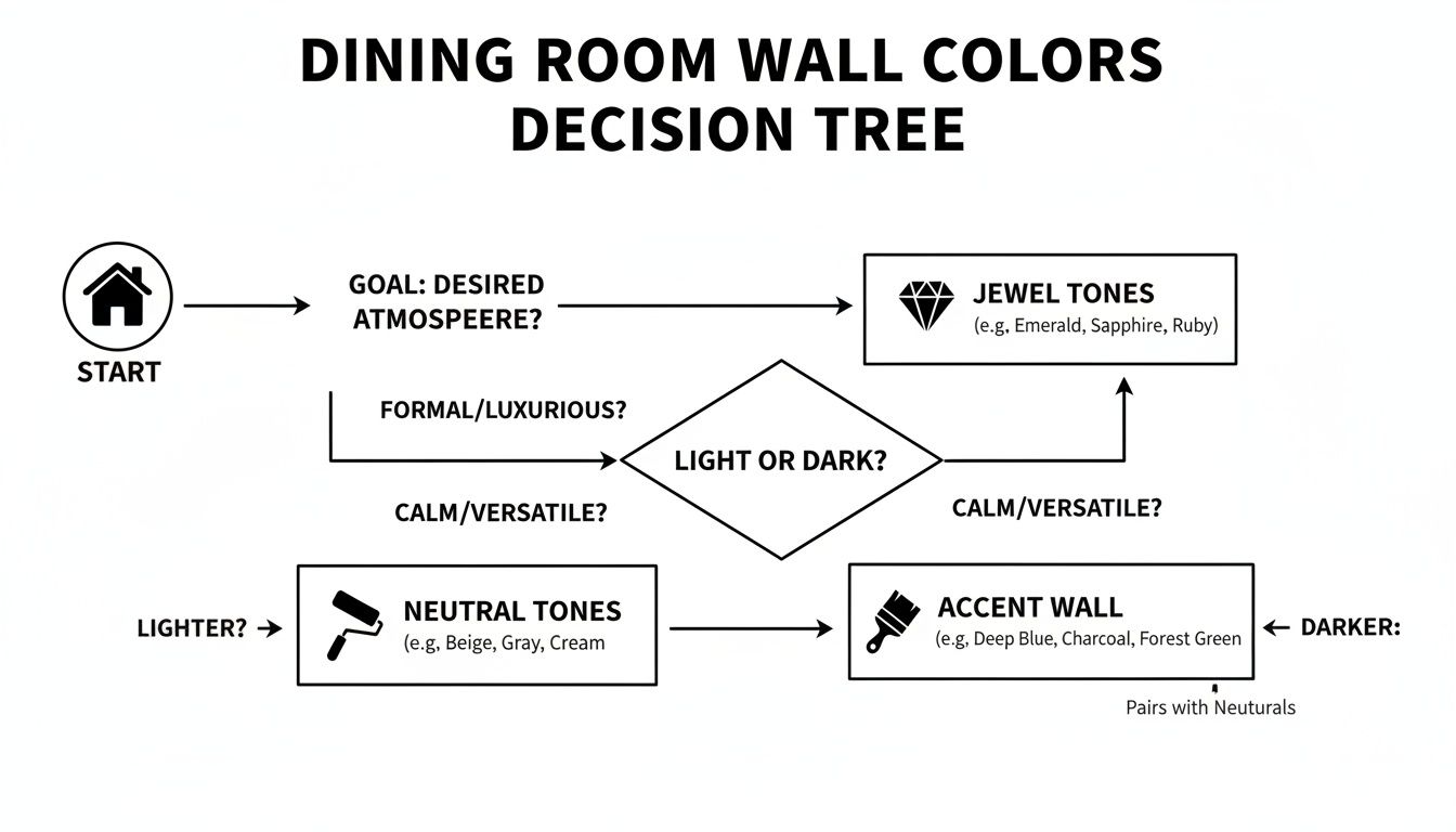
This chart highlights which palette delivers drama, comfort, or energy under different conditions.
For more inspiration, check out our guide on picking the perfect paint color for your home.
Visit our Freehold, NY showroom to test swatches on your own walls. Use flexible financing to pair paint and furniture, and bring your dream dining room to life with one-stop shopping for decor, flooring, and mattresses.
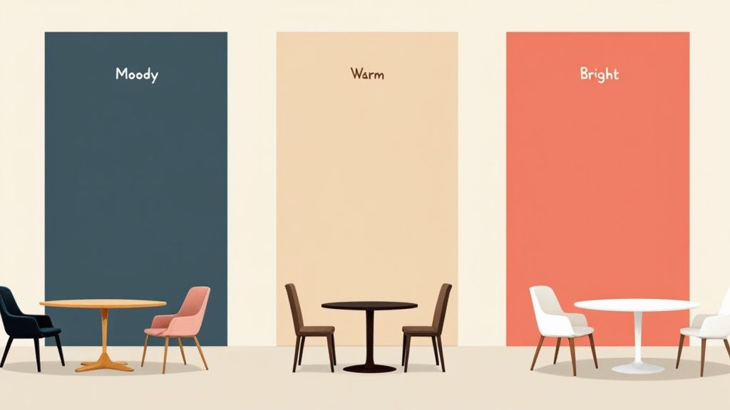
Understanding Color Theory And Mood
Picking the right paint is more than clicking a swatch—it’s about crafting atmosphere. At the center of every color scheme lie hue, saturation, and lightness. Tinker with these, and you can host intimate winter dinners under warm reds or flood the room with an energetic summer glow.
At Tip Top Furniture & Mattresses, we partner with 50+ trusted manufacturers and offer heirloom-quality Amish Furniture to ensure your color choices complement top-tier craftsmanship. Natural and artificial light change everything. A shade that looks crisp at noon can feel sleepy by candlelight. Knowing how these components interact with your room’s lighting sets the stage for drama, calm, or somewhere in between.
Exploring Hue, Saturation, And Lightness
Hue acts like a spice in your design recipe—it’s your base color family: red, green, blue, and so on.
Saturation turns the volume up or down on that hue. A highly saturated wall feels as rich as velvet, while a muted tone sits back softly, like a whisper.
- Warm Reds: stoke appetite and flicker like candlelight.
- Cool Blues: relax the senses like a gentle afternoon breeze.
- Earthy Neutrals: create a stable canvas that highlights wood grains.
Lightness adjusts brightness from near-black to pure white. Play with it to avoid a cave-like effect or a washed-out finish.
Etsy searches for “blue copper” leapt more than threefold in a single year, and editors from Elle Decor to Architectural Digest have spotlighted similar shades. Discover more seasonal color trends at Elle Decor’s Paint Colors of the Year 2026.
“Hue, saturation, and lightness are the three pillars of color harmony.” — Design Expert
Pairing Colors With Mood
Your wall shade should converse with your chairs, tables, and floors. Here’s how:
- Cozy Heritage: Warm neutrals plus dark wood for an inviting, traditional vibe.
- Dramatic Contrast: Jewel tones on pale floors to make the room pop.
- Vibrant Accent: Paint one wall a bold hue to spark lively conversations.
Want to see these ideas in action? Check out our Color-Coordinated Settings And Mood Guide.
Since 1978, our Freehold, NY design team has guided Albany homeowners toward color schemes that harmonize with heirloom-quality Amish furniture and hardwood floors.
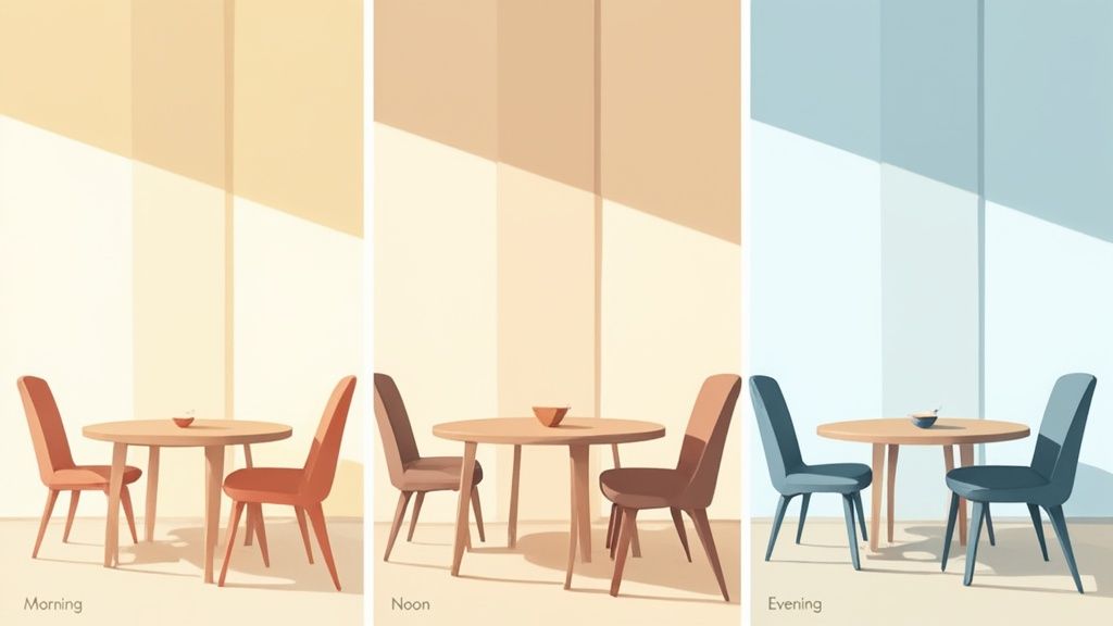
Assess Light and Space In Your Dining Room
Stepping into your dining room at sunrise, midday and after dark reveals surprising shifts in color. One wall might glow under morning rays while the opposite side slips into shadow.
A quick lighting check like this ensures you choose colors dining room walls that stay true all day long.
- Morning Test: Place a white card against each wall at sunrise and note brightness.
- Afternoon Check: Record glare spots or dim corners as the sun moves.
- Evening Assessment: Turn on your pendant and wall sconces to see paint under warm light.
Next, factor in room size and ceiling height. High ceilings lend themselves to deep, moody shades feeling surprisingly airy. In tighter spaces, light neutrals keep things open and breezy.
Check out our guide on How to Make a Small Room Feel Big for compact space tricks.
Testing Wall Brightness
Pull out a color meter or download a light-reading app to measure levels in foot-candles or lux. Jot down readings every few hours so you spot peak brightness and shadowed lulls.
Having this data helps you pick a paint finish that handles glare without looking dull.
Insight: Walls clocking under 300 lux will soak up pigment, turning crisp whites into off-white tones.
Next, tape a 4×4-inch paint swatch on three different walls. Observe it at dawn, noon, and dusk. This hands-on trick prevents any hue surprises once you roll on the big batch.
Choosing Paint Finishes
Different finishes handle light—and life—very differently. Here’s a quick breakdown:
- Durability: Semi-gloss stands up to scuffs in high-traffic spots.
- Cleaning: Satin gives you enough sheen to wipe away wine splatters with ease.
- Texture: Matte masks surface flaws—perfect for older walls with uneven plaster.
Once you’ve mapped out your light and space variables, head to Tip Top’s free online room planner to visualize your chosen colors dining room walls in a lifelike setting.
For a hands-on experience, swing by our Freehold, NY showroom. Bring home real-world paint samples, browse our curated flooring options, and book your complimentary Design Consultation. Our experts will walk you through finish options, lighting tests, and pairing colors with our signature Amish pieces.
Pair Wall Colors With Furniture And Flooring
Choosing the right wall paint isn’t just about picking your favorite hue. It’s more like conducting a symphony—each element has to play in harmony. When walls, wood grains, and fabrics speak the same design language, your dining room feels intentional and lived-in.
In places from Freehold, NY to the Greater Albany Capital Region, homeowners see how a thoughtful palette can transform tight or sprawling spaces alike. For instance, warm neutrals can make a snug dining nook feel welcoming, while jewel tones turn a pale-floored room into a dramatic showpiece.
- Warm Neutrals absorb light for a cozy atmosphere
- Dark Wood Floors give weight and depth to any layout
- Jewel Tones pop brilliantly against light flooring
- Pale Woods provide a crisp canvas for bolder walls
Layer in an area rug that echoes both your floor finish and wall shade to tie everything together. And don’t forget—one-stop shopping makes it easy to coordinate paint with our handcrafted Amish Furniture, custom Flooring, and USA-made Mattresses. An adjacent seating nook becomes even cozier with a mattress topped in complementary wall colors.
Matching Warm Neutrals With Dark Floors
Warm neutrals—think taupe, greige or sandy beige—set a friendly, adaptable foundation. Pair these with rich, dark floors like walnut or espresso oak, and you’ve got a classic farmhouse feel without sacrificing modern polish.
- Balanced contrast that’s never jarring
- A timeless backdrop for patterned or textured rugs
- Seamless coordination with cream-toned upholstery
“A neutral wall on dark floors strikes the perfect balance between warmth and structure.” — Local Designer
That interplay reminds me of candlelit dinners around an Amish table: intimate, grounded and effortlessly stylish.
Jewel Tones And Metallic Accents
When you want to dial up the drama, jewel-toned walls—emerald, sapphire or ruby—are your fast track. Light-hued floors reflect that color punch, while metallic accents in brass, chrome or copper add a lively shimmer.
| Wall Color | Flooring Type | Accent Metal |
|---|---|---|
| Emerald | White Oak | Brass |
| Sapphire | Maple | Chrome |
| Ruby | Bamboo | Copper |
These pairings work beautifully with our custom flooring selections and showroom metal hardware. If your dining area flows into a living space, match a light-wood daybed with a USA-made mattress to keep the visual rhythm going.
Coordinating Upholstery, Wood Finishes And Rugs
Pulling together walls, floors and furniture can feel like juggling three balls at once. But here’s a simple, hands-on sequence to keep things smooth:
- Lay paint swatches next to your fabric samples.
- Place small hardwood floor scraps under the swatches.
- Top it off with a rug sample to preview the full effect.
- Adjust accent pillows or tabletop décor until you hit the sweet spot.
- Stop by our Freehold, NY showroom for real-time mixing and expert feedback.
For a step-by-step on getting started, check out our guide: https://tiptopfurniture.com/designing-a-dining-room-where-to-start/
Tip Top makes one-stop shopping a breeze with financing, custom orders, and design services all under one roof.
Comparison Of Pairing Moods
Here’s a quick look at how certain combinations can shift the vibe in your dining room:
| Pairing Combo | Mood Impact |
|---|---|
| Taupe Walls + Walnut Floors | Cozy and Grounded |
| Emerald Walls + White Oak Flooring | Dramatic and Airy |
| Greige Walls + Espresso Floors | Modern Classic |
With these guidelines, you’re ready to pick colors dining room walls that complement your floors and furnishings. Swing by our showroom in Freehold or schedule a delivery anywhere in the Capital Region to see your vision come to life.
Trending And Timeless Dining Room Palettes
Your dining room walls are more than four flat planes—they’re the backdrop for every meal, conversation, and memory. In recent seasons, deep jewel tones have sashayed into the spotlight, while warm neutrals and glossy lacquers continue to charm with timeless appeal. We’ll unpack both styles so you can choose the one that best suits your home’s personality and resale goals.
If you’ve noticed homes bathed in emerald, plum, or navy lately, you’re onto the dining room evolution that major outlets call measurable. Want the data? Check out the House Beautiful Trend Report for the full story.
Case Studies On Resale And Ambiance
- In an urban loft, a navy dining room ramped up buyer interest by 12%, wrapping guests in cozy drama that felt both modern and inviting.
- A suburban home refreshed with creamy lacquer enjoyed a 7% resale boost, plus walls that wipe clean after lively family gatherings.
- On a historic farmhouse, forest green accent walls elevated the perceived craftsmanship—leading to a 15% sale above market estimates.
Each example proves that your color choice can sway both mood and market value with surprising impact.
“The right palette boosts both mood and market appeal,” says a local design expert.
Key Features Of Each Palette
- Trending Jewel Tones: Rich, saturated hues (think emerald, navy, plum) that add dramatic depth in sunlit spaces.
- Timeless Warm Neutrals: Soft taupe, greige, and sandy beige tones that cozy up any room and pair effortlessly with wood accents.
- Lacquered Finishes: A gentle gloss (gloss white or soft cream) that reflects light, hides fingerprints, and stays fresh over time.
Identify your room’s natural light and existing furniture to match these features with the atmosphere you crave.
Comparison Of Trending Vs Timeless Palettes
Here’s a quick side-by-side look at bold jewel tones versus classic neutrals and lacquered finishes.
| Palette Type | Example Hues | Key Features |
|---|---|---|
| Trending Jewel Tones | Emerald, Navy, Plum | Dramatic depth and mood impact |
| Timeless Warm Neutrals | Taupe, Greige, Sandy Beige | Cozy versatility and easy pairing |
| Lacquered Finishes | Gloss White, Soft Cream | Reflective surface and low-maintenance sheen |
This comparison should help you weigh drama against durability when picking your next dining room shade.
Pairing Suggestions And Accent Integration
- Pick a single wall for a bold accent or lacquered panel to anchor the space.
- Frame windows and doors in crisp white or a subtle metallic to define edges.
- Coordinate cabinetry or shelving in a complementary tone for visual balance.
- Tackle textiles—upholstered chairs, draperies, rugs—in matching or contrasting shades to tie it all together.
These steps guide you through a cohesive look that never feels haphazard.
Accent Walls And Built-In Cabinetry
An emerald accent wall plays beautifully against creamy cabinets, giving your dining table a natural stage. Try these tricks:
- Choose cabinetry in a hue opposite on the color wheel for lively contrast.
- Use a muted shade of your main color on built-ins for seamless cohesion.
- Highlight under-cabinet lighting to create depth and interest.
Always sample paint and cabinet swatches under your actual dining lighting before committing.
You might be interested in exploring more on refining your dining room palette in our article An Expert’s Guide to the Perfect Color Palette.
Visit our Freehold, NY showroom to preview seasonal color deals and clearance fabric samples.
Select Finishes And Finalize Your Color Plan
Choosing the right sheen brings both function and flair to your dining room. It influences how light dances across the walls and how well the surface stands up to everyday life.
A well-picked finish can hide scuffs, brighten a cozy corner, or add that gentle glow you’ve been picturing. Let’s dig into the options and nail down a plan you’ll love.
Compare Paint Finishes
- Matte: A muted, flat appearance that masks wall flaws. It’s cozy but prone to scuffs in high-traffic areas.
- Eggshell: A gentle sheen that stands up to light cleaning. Perfect if you want a bit of warmth without going glossy.
- Satin: Soft glow meets easy maintenance. Ideal for a family dining spot where spills happen.
- Semi-Gloss: Noticeable shine with top-tier stain resistance. Best for trim, doors, and focal walls.
- Lacquer: High-impact, glass-like finish that captures every ray of light. It’s dramatic and durable, especially around molding and features.
“Picking a finish is as important as picking the color itself.”
Test And Evaluate Finishes
Start by taping sample swatches on different walls. Take a damp cloth and gently rub them to see which one resists stains best.
Watch each finish in morning sun and under overhead lights. You’ll spot subtle shifts in glow and depth.
And here’s a trend to note: warm, earthy neutrals paired with high-gloss or lacquered finishes are climbing in popularity. Designers at LuxeSource point out lacquer’s reflective charm alongside a neutral color resurgence in homes and eateries alike.
Step-By-Step Final Checklist
- Assess Space: Record room dimensions, ceiling height, and natural light patterns.
- Apply Test Swatches: Check finishes at dawn, midday, and dusk.
- Evaluate Cleaning: Wipe each swatch to test stain removal.
- Book Your Complimentary Design Consultation: Connect with our experts at Tip Top Custom Orders.
- Apply for Flexible Financing Now: Visit our Financing page.
- Order Custom Palettes: Match paint samples to your furniture pieces.
- Schedule Delivery: Sync paint and materials drop-off with your timeline.
- Coordinate Installation: Plan painting around new flooring or furniture arrival.
- Check Clearance Deals: Snag last-minute accents to complete the look in our Clearance section.
| Finish | Sheen Level | Ideal Use |
|---|---|---|
| Matte | 1–10% | Low-traffic walls |
| Eggshell | 10–25% | Casual dining areas |
| Satin | 25–35% | Everyday wipe-down zones |
| Semi-Gloss | 35–70% | Trim, doors, high-touch spaces |
| Lacquer | 70–90% | Feature walls, architectural trim |
Coordinate With Decor And Furniture
Link your wall finish to existing pieces for a cohesive design. Use the paint code when ordering custom upholstery or drapes.
Before you commit, place flooring samples beside painted panels. This simple test reveals whether warm or cool undertones win the day.
- Match cushion fabrics to your walls for continuity.
- Hold wood-stain samples next to paint swatches before deciding.
“Coordinated finishes tie every element in the room.”
Order accent pillows and table linens that echo your new wall color on our Custom Order page. Then step back and re-inspect how wood tones play off each sheen to be sure everything feels in harmony.
Maintenance And Touch-Up Tips
Even a well-chosen paint will face accidental spills and scuffs. Wipe any mess immediately with a soft cloth and mild soap.
Keep a small can of your exact paint and sheen on hand for quick fixes. Label it clearly with the room name and finish.
- Sand edges of chips lightly before repainting for a seamless patch.
- Use a non-abrasive sponge with warm water on stubborn marks.
A weekly dust-down prevents grime building up, so your walls stay fresh far longer.
Next Steps And Installation Tips
Once you’ve locked in color and finish, here’s how to see it all the way through:
- Order paint from our store or partner brands.
- Book pros from our recommended painter network.
- Plan furniture placement after walls are dry to avoid mishaps.
Before the first drop of paint, remove hardware and shield floors with drop cloths. After painting, give walls a full 24-hour cure before rehanging art or reinstalling trim.
Browse our Clearance section for discounted decor pieces that’ll pop against your fresh walls.
Schedule Your Final Design Touch
Your ideal dining room awaits right here in Freehold, NY. Drop by our showroom for live finish demos and sample swatches.
Prefer a digital touch? Book a virtual color session with our design team. We’ve been helping homeowners bring their vision to life since 1978.
Apply for flexible financing or visit us in person at Tip Top Furniture & Mattresses. Explore paint swatches alongside our handcrafted Amish furniture and flooring options. We make one-stop shopping feel effortless.
Dining Room Color FAQs
Picking the perfect paint shade for your dining room doesn’t have to feel impossible. Here’s a fast-track guide for Albany and Capital Region homeowners ready to decide with confidence.
If your dining area doesn’t get much sun, lean on soft warm neutrals or sprinkle in light-reflecting accents. These tones will keep the room feeling bright and spacious.
- Grab 4×4-inch paint swatches and place them on three different walls.
- Check each swatch in daylight, at dusk, and under your everyday lighting.
- Tweak the saturation until the color reads true no matter the hour.
For anyone who loves hosting dinner parties, a satin or semi-gloss finish is your best friend. These finishes resist stains and wipe clean in seconds.
Before you invest in full cans, test a handful of hues with sample pots or peel-and-stick swatches. You’ll avoid unpleasant surprises when you tackle the entire wall.
“Always test swatches on each wall to see true color shifts.” — Tip Top design team
To harmonize walls with your furniture and flooring, focus on matching undertones. Our free online room planner lets you mix and match colors with Amish tables or custom Freehold flooring before you buy.
Next Steps
- Book a free design consultation at our Freehold, NY showroom.
- Apply your sample swatches using our professional tips.
- Finalize your palette and lock in an installation date.
- Explore flexible financing for paint and furniture bundles.
Ready to transform your dining room walls? Visit Tip Top Furniture & Mattresses to book your session today!