
Colors That Go with Terracotta: Palettes for Every Room


A terracotta pillow can look warm and balanced under showroom lights, then feel too orange beside a gray sofa at home. A clay colored chair can also turn muddy on a medium brown floor. The problem usually isn't terracotta itself. It's the undertone of that particular clay shade, the daylight in the room, and the finish on the floor, fabric, or wall beside it. Start with proven pairings, then test them against the surfaces already in the home.
Colors That Go with Terracotta at a Glance
The safest starting rule is simple. Use blue as the anchor and terracotta as the warmth. Blue cools terracotta's red-orange base, while terracotta keeps blue from feeling cold or formal. That balance works in a navy living room, a dusty blue bedroom, and a blue-gray open plan space across Albany, Troy, Schenectady, and Greene County.
Consumer preference supports that order. In the MasterBrand Cabinets survey of more than 700 people reported by Apartment Therapy, blue and green together were selected by 61% of respondents as preferred interior design colors, compared with 20% for pink, terracotta, and beige. Terracotta therefore has the broadest appeal as an accent beside blue family colors, not spread across every wall and large piece.
Ten Pairings Worth Testing First
| Pairing color | Mood | Best use | Why it works |
|---|---|---|---|
| Navy | Tailored, high contrast | Sofa with terracotta pillows | Dark value anchors warm clay |
| Slate or dusty blue | Calm, balanced | Bedroom textiles and bedding | Cools red-orange without harshness |
| Blue-gray | Modern, crisp | Flooring and metal frames | Neutral separates two strong hues |
| Sage | Organic, soft | Rug or accent wall | Desaturated green echoes vegetation |
| Olive | Earthy, grounded | Dining chairs or case goods | Shares the warm undertone |
| Deep green | Traditional, rich | Curtains or upholstery | Balances warmth with depth |
| Cream or ivory | Bright, traditional | Walls and ceilings | Lightens the baked clay base |
| Natural oak or walnut | Warm, organic | Floors and furniture frames | Reinforces the earth toned character |
| Brass or antique gold | Warm, refined | Lamps and hardware | Adds metallic warmth without a new hue |
| Teal or blue-green | Vivid, graphic | Small accents only | Complementary to terracotta near 190 degrees |
Cream and soft white matter more than homeowners expect. Placed between navy and terracotta, a pale neutral gives each color room to read clearly. Natural wood does a different job. Pale oak softens the scheme, while walnut adds depth beside clay upholstery, woven rugs, and stone accessories.
Start blue, add clay, separate with cream. That sequence prevents terracotta from taking over a room that needs to work in bright summer light and dark winter afternoons.
The table gives the shortlist for Colors That Go with Terracotta. It doesn't finish the decision. A pinkish clay fabric beside red oak needs a different partner than saturated orange tile beside pale maple. Real fabric, wood, and flooring samples reveal that difference faster than a screen swatch. Homeowners in the Capital Region should compare those samples together before ordering a sofa, rug, or custom upholstered chair.
Colors That Clash With Terracotta
Clay shades usually fail when two warm midtones sit side by side. A terracotta sofa against a medium-brown floor can lose definition, while saturated accents compete for attention. Dark companions can also make a north-facing room feel dimmer. A U.S. government interior daylighting guide lists reflection factors of about 25% for medium brown, 35% for mustard yellow, and about 10% for black. These figures help explain why those colors need careful placement beside terracotta.
Four Combinations to Limit
- Brown on brown: A terracotta sofa against a medium-brown floor, walnut frame, and no pale rug can read muddy. Add cream, ivory, or pale sand beneath or behind the clay piece.
- Bright red or hot pink: Saturated red cushions beside an orange-rich terracotta chair create competing warm focal points. Swap one for dusty rose, warm white, or muted blue-gray.
- Mustard or yellow-orange: Mustard pillows, art, and throws can make the palette feel busy and retro. Brass or antique gold adds warmth with less color.
- Large areas of charcoal or black: A black rug and charcoal sofa can leave a low-light room feeling dim beside terracotta. Use black for lamp bases, picture frames, side tables, or hardware instead.
Check the pairing against the room's actual floor and largest furniture piece. Place the samples side by side, then look from across the room. If their edges blur, add a lighter neutral. If both colors compete for attention, replace one with a less saturated shade.
Why Cool Colors, Undertone and Finish Shape Terracotta
Terracotta works like a warm voice in a room. Cool colors supply the steady bass line that keeps that voice from shouting. Without sage, navy, blue-gray, or muted teal, clay tones can stack up until the whole palette feels hot. With one controlled cool partner, the same terracotta looks intentional.
The color wheel explains the strongest contrast. The College of Tropical Agriculture and Human Resources color guide classifies red-orange, also called vermillion or terra-cotta, as one of six tertiary colors and lists blue-green as its complementary counterpart. Teal, muted turquoise, and blue-green therefore intensify terracotta when placed beside it. A small teal stool can make a clay pillow look more vivid without another warm accent.
That intensity needs restraint. The Colourwise guide to terracotta places a terracotta near 10 degrees opposite a complementary region around 190 degrees, and favors cool, desaturated complements because highly saturated versions can feel visually aggressive. Translation for furniture shoppers is direct. Choose dusty teal over electric turquoise, slate over royal blue, and sage over bright green.
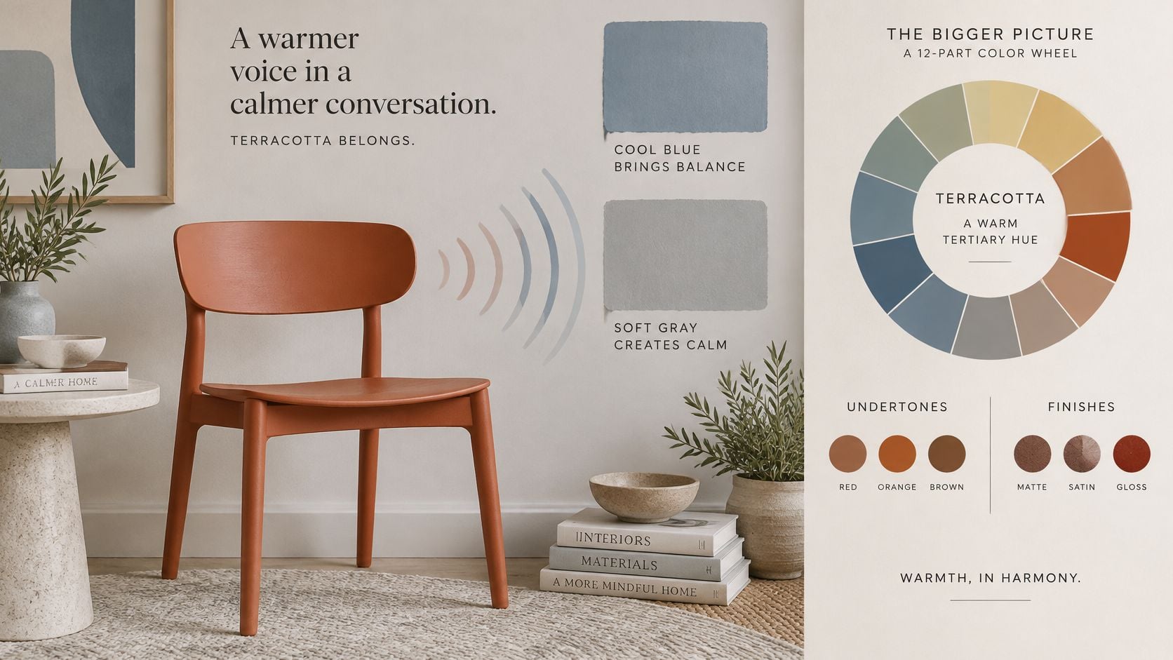
Sort the Terracotta by Undertone
Not every fabric labeled terracotta behaves the same way. Hold the sample against white paper, then against the floor. The hidden pink, orange, or brown cast becomes easier to see.
- Pinkish or dusty terracotta: Pair it with muted sage, mushroom, and soft blue-gray. These partners respect the cooler, quieter cast and suit bedrooms, upholstered headboards, and low contrast living rooms.
- Orange rich terracotta: Use navy, muted teal, or charcoal to cool the glow. A navy rug under a saturated clay chair gives the eye a firm boundary.
- Dark terracotta: Balance it with ivory, pale sand, or veined stone. The light surface does the separation work, especially beside walnut, aged leather, or dark bronze.
Warm white or sand should usually carry the largest light area. Sage or blue-green can then enter through a rug, artwork, case goods, curtains, or throw pillows. Navy creates stronger value contrast and a polished result. Sage and olive lower the intensity and produce a calmer, plant connected room.
Finish Changes the Color
A matte terracotta wall absorbs more light and looks softer than the same hue on glossy tile. Lacquered case goods reflect windows and lamps, sharpen edges, and can make clay look redder. Nubby upholstery breaks light across the surface, which often makes saturated fabric feel easier to live with than smooth vinyl or polished ceramic.
Existing finishes get a vote. Red oak floors amplify orange rich terracotta. Pale oak supports dusty clay without adding more heat. Cool gray tile can make a pinkish terracotta look cleaner, while warm beige tile may pull it toward peach. Shoppers comparing an earth tone color palette for coordinated furniture and decor should carry the floor and upholstery samples together, not choose each finish in isolation.
A color wheel suggests a partner. The actual floor, fabric sheen, and window light approve or reject it.
The reliable sequence is undertone first, finish second, partner third. Identify whether the clay sample leans pink, orange, or dark brown. Check whether it's matte, woven, glossy, or lacquered. Only then choose navy, sage, teal, or cream. That order prevents expensive surprises with custom upholstery, solid wood finishes, flooring, and large rugs in Capital Region homes where winter daylight can expose a mismatch for months.
Lighting and Daylight Changes for Capital Region Homes
The same terracotta throw can glow beside a warm lamp at night and turn dull brown under cool daylight bulbs the next morning. Light doesn't merely reveal the palette. It changes whether clay reads pink, orange, red, or brown, and whether sand looks warm or gray.
For living rooms and bedrooms, the University of California, Irvine color contrast guidance is paired in design practice with lighting around 2700-3000 K and a color rendering index of 90 or higher when accurate reds and earthy materials matter, while 5000-6500 K light can shift terracotta toward brown. Bulb selection should happen before final fabric approval, not after delivery.
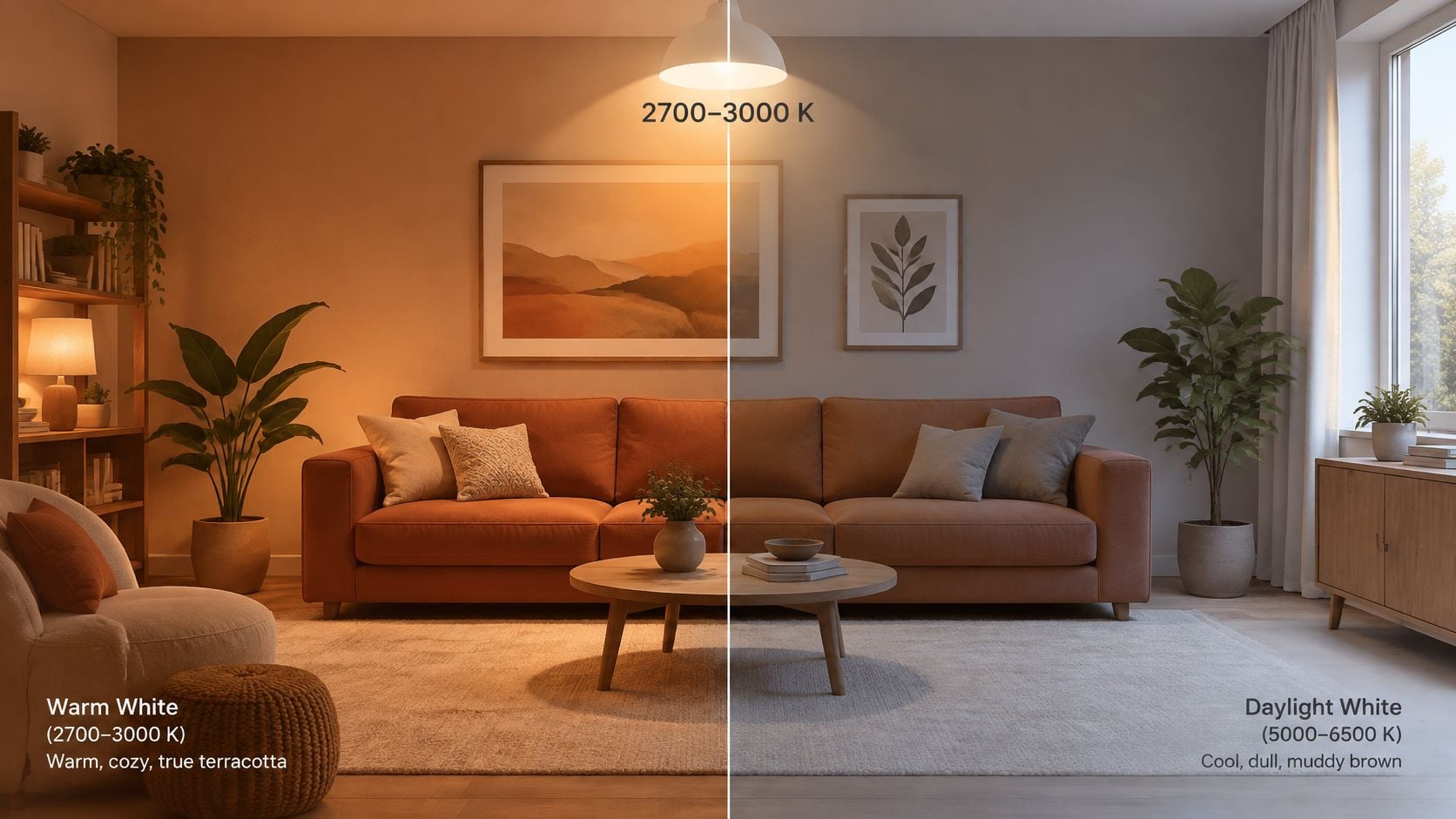
Terracotta Choices by Light
| Light condition | Color temperature | Terracotta choice | Partner color |
|---|---|---|---|
| Low daylight from north facing windows | 2700-3000 K | Lighter, slightly pinker terracotta | Warm white or cream |
| Bright south facing sun | 2700-3000 K | Balanced mid-tone terracotta | Chalky white or pale mushroom |
| Evening lamp light | 2700-3000 K with CRI 90 or higher | Standard terracotta | Warm neutrals and brass |
| Cool daylight bulbs | 5000-6500 K | Avoid saturated orange-brown | Navy or teal to counter dullness |
North facing rooms in Greene County and the wider Capital Region need the lightest touch. A slightly pinker clay, warm white walls, pale oak, and reflective brass keep the palette awake during short winter days. Heavy charcoal drapery or a dark brown rug can close the room down by mid-afternoon.
South facing rooms need the opposite discipline. Strong sun already warms terracotta, so chalky white, pale mushroom, and muted blue-gray prevent the scheme from becoming orange on orange. Homeowners planning lamps and window treatments alongside living room lighting placement guidance should review samples in the morning, afternoon, and evening. A fabric that passes all three checks is ready for a sofa. A fabric that only works at noon belongs on a pillow.
Room-by-Room Terracotta Palettes for Capital Region Homes
Each room needs one clear job for terracotta, one neutral base, and one accent. Assigning those roles prevents clay from appearing randomly on every pillow, vase, and wall. It also makes custom ordering easier because fabric, wood finish, flooring, and window treatments can be coordinated as one palette.
Terracotta has staying power beyond a seasonal trend. An Another Magazine account of terracotta design history traces terracotta use to at least 5,000 years ago and identifies a Mohenjo-Daro figurine dated approximately 2700-2100 BC. That long history fits its natural partners. Olive and deep green echo vegetation, cream lightens baked clay, and muted blue adds contrast without making a room feel artificial.
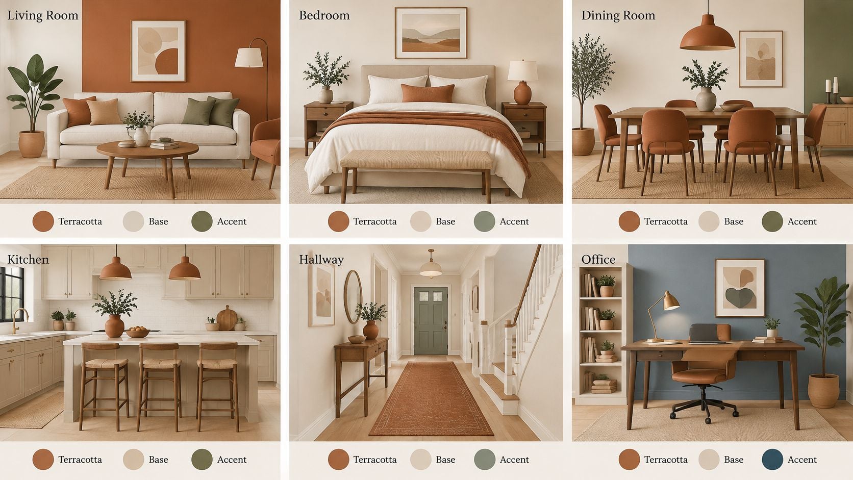
Palettes by Room
| Room | Terracotta role | Neutral base | Accent color |
|---|---|---|---|
| Living room | Sofa or accent wall | Warm white or sand | Navy or sage rug |
| Bedroom | Headboard or textiles | Cream or linen | Dusty blue-gray bedding |
| Dining room | Upholstered chairs | Pale oak floor | Olive or deep green sideboard |
| Home office | Accent chair | Light gray walls | Navy desk accessories |
| Open plan space | Rug and pillows | Ivory | Teal artwork |
| Youth bedroom | Bedding or stool | Soft white walls | Sage or muted blue |
A living room can carry the largest terracotta piece because other furniture provides balance. A clay sofa needs a pale rug, cream walls, and one navy or sage layer. Rustic schemes can also borrow restraint from equestrian living room color palettes, where leather, wood, cream, and deep accent colors work without turning the room into a theme display.
Bedrooms work better with softer placement. Terracotta bedding, an upholstered headboard, or a bench can warm cream walls while dusty blue-gray keeps the room restful. The same logic applies to USA made mattresses and layered bedding, since the bed covers a large visual area. Additional bedroom color scheme ideas for balancing warm and cool tones can help homeowners decide whether clay belongs on textiles or painted walls.
Dining rooms benefit from terracotta on chair seats rather than every surface. Pale oak flooring, an Amish made solid wood dining table, and an olive sideboard make clay upholstery feel grounded. In an office, one terracotta chair against light gray walls gives warmth without distracting navy storage or desk accessories.
How Much Terracotta to Use and Where
Terracotta doesn't have to dominate to change a room. It can act as the warm bridge between cool gray interiors and natural materials, while pale neutrals preserve brightness. That role suits northern homes where a fully saturated clay scheme can feel cave-like in January.
A recent House Digest desert palette recommendation uses a 60/30/10 distribution, with warm neutral as the dominant base, terracotta or another earthy tone as the secondary color, and a contrasting accent as the remainder. Applied to furniture, that formula gives shoppers a stopping point before every accessory becomes clay colored.
The 60/30/10 Split
- Dominant base: Use warm white, sand, linen, or pale oak on walls, ceilings, large rugs, and major floor areas.
- Secondary color: Place terracotta on one sofa, a pair of chairs, drapery, or one feature wall, then soften it with blue-gray or sage cushions.
- Accent: Reserve navy, muted teal, or brass for pillows, art, lamps, vases, and small decor.
Placement controls weight. A terracotta feature wall behind a cream bed feels strong but contained. A clay sofa carries more visual weight than the same color on dining chairs because it sits at the center of the room. A rug spreads the color widely, though pattern and pale borders can reduce its intensity. Accessories give the lowest commitment and suit renters, new movers, and anyone testing ways to add color without painting.
Northern light calls for one large terracotta element, not three. Choose the sofa or the feature wall. Let ivory walls, linen curtains, pale oak flooring, and light upholstery handle the rest. Softer grounded clay beside olive, warm sage, mushroom, and warm stone feels more durable than a saturated Southwestern scheme repeated across an open plan home.
Signs of excess are easy to spot. The room feels dim before evening, wood tones disappear into the upholstery, or every accent competes for attention. Remove one warm layer first. A cream throw, pale rug, or blue-gray cushion often fixes the balance without replacing the main furniture piece.
Confirm Your Palette Before You Buy
A confident terracotta purchase follows a short sequence. The goal is to test the color against the room that exists, not the room shown in a catalog photograph.
Five Checks Before Ordering
- Choose one pairing: Select the mood from navy, sage, olive, blue-gray, cream, or teal.
- Check the undertone: Compare the clay sample with the existing floor, tile, sofa, and wood finish.
- Set the proportion: Assign the neutral base, terracotta role, and small accent before shopping.
- Test the light: Review samples during morning, afternoon, and evening hours.
- Confirm in place: Hold the final fabric or finish against the actual wall, floor, and neighboring furniture.
Screen color deserves special caution. Phone displays, store lighting, and dye lots can shift clay toward peach or brown. Guidance on how to avoid color mismatch when ordering online is especially useful for custom upholstery, where fabric selection affects the whole room.
Buy the sample test, not the screen image. One afternoon with real materials prevents years of living beside the wrong undertone.
The free online room planner can show whether a terracotta sofa overwhelms the layout or leaves enough pale floor visible. A complimentary design consultation, a service available since 1984, can then coordinate fabric, Amish made wood finishes, flooring, window treatments, and decor. Flexible financing can spread a full room project into manageable payments, while the Clearance Corner suits a single accent chair, lamp, or rug. For homeowners from Freehold to Albany, comparing samples in person remains the most reliable final step.
Bring fabric, flooring, and finish samples together and build a terracotta palette that fits the light in a Capital Region home, with furniture, mattresses, flooring, custom order options, and design help available in one family owned Freehold showroom serving the region since 1978. Visit Tip Top Furniture & Mattresses to plan a room, explore Amish made and custom pieces, or book a design consultation before ordering.