Best Colors That Go with Navy for Your Home in 2026


A lot of homeowners start in the same spot. There is a navy sofa they love, a paint swatch pinned to the fridge, or a bedroom set in a deep blue finish, and one big question follows fast. What goes with navy without making the room feel dark or too formal?
Navy stays popular because it solves a real decorating problem. It gives a room weight and polish, but it is usually easier to live with than black and more distinctive than standard gray. In Upstate New York homes, that matters. Light shifts dramatically between bright summer afternoons and long winter mornings, so a color that looks balanced in both conditions earns its keep.
The supporting color does the heavy lifting. Pair navy with the wrong white, beige, or accent tone, and the room can feel flat or heavy. Pair it well, and the same navy reads crisp, warm, relaxed, or tailored. That is why many homeowners start with a broader expert guide to the perfect color palette before choosing furniture, flooring, and finishing touches.
At Tip Top Furniture & Mattresses, a family-owned showroom serving Freehold, Albany, Schenectady, Troy, and the Capital Region since 1978, we help homeowners work through these choices every day. Navy comes up in living rooms with custom Amish tables, bedrooms with upholstered beds, dining rooms that need warmth, and home offices that should feel sharp without feeling stiff. The goal is not just to pick a good-looking color on paper. It is to build a room that fits the house, the light, and how the family lives.
This guide focuses on pairings you can use in real homes, with practical ways to carry them through furniture, rugs, window treatments, and flooring. If navy and white is already on your mind, this styling guide for navy and white curtains is a helpful starting point for the window side of the plan. For anyone trying to make a navy piece work in a Capital Region home, these are the color combinations worth considering.
Table of Contents
- 1. Navy & White
- 2. Navy & Gold
- 3. Navy & Cream/Ivory
- 4. Navy & Soft Gray
- 5. Navy & Warm Beige/Tan
- 6. Navy & Blush Pink
- 7. Navy & Forest Green
- 8. Navy & Coral/Peach
- 9. Navy & Soft Yellow/Butter
- 10. Navy & Warm Terracotta/Rust
- 10 Color Pairings That Complement Navy
- Bring Your Vision to Life in Freehold, NY
1. Navy & White
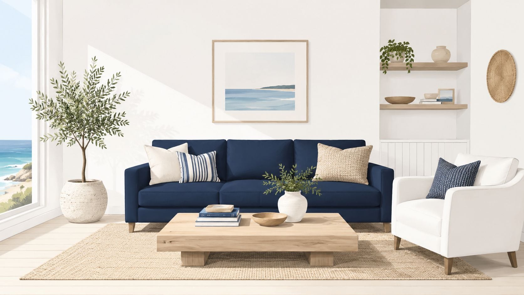
A lot of homeowners walk into our Freehold showroom with the same concern. They want color, but they do not want the room to feel risky or hard to live with by February. Navy and white solves that problem better than almost any pairing I use.
It gives you contrast, clarity, and a finished look without boxing you into one style. In an older farmhouse, it feels clean and polished. In a newer home near Albany, it reads crisp without feeling cold. For Upstate NY homes that need to handle muddy boots, cloudy winters, and real family use, that balance matters.
Why this pairing always works
Navy has enough depth to anchor a room. White keeps that depth from getting heavy. The result feels structured and calm, which is why this pairing works in living rooms, bedrooms, dining rooms, and even entry spaces.
The trade-off is simple. Too much bright white can make navy feel sharp, especially in rooms with limited natural light. I usually guide homeowners toward a softer white on walls or upholstery, then let navy carry the stronger visual weight through a sofa, headboard, accent chairs, or a patterned area rug.
A few choices make the room feel finished instead of stark:
- Choose the right white: Soft white or warm white usually sits better in everyday spaces than a glaring builder-grade white.
- Add natural materials: Oak, maple, cherry, and other wood tones keep the room from feeling flat. This is one place where custom Amish dining pieces, end tables, or bed frames make a real difference.
- Use texture on purpose: Linen drapes, woven baskets, wool rugs, and cotton bedding soften the contrast and make the palette easier to live with.
- Watch the lighting: North-facing rooms around the Capital Region often read cooler. Warm bulbs and warmer whites help balance that out.
In a living room, a navy sofa with white walls and medium-tone hardwood usually lands well. In a bedroom, white bedding with a navy upholstered bed gives you the same contrast in a quieter way. If you want more color without repainting, our ideas for adding color to your home without painting can help you build around navy through rugs, accent furniture, and textiles.
Practical rule: If navy and white feels too sharp, add wood, fabric texture, or one small warm accent before changing the whole palette.
For homeowners building around a navy sofa or dining set, Tip Top's own expert guide to the perfect color palette is a useful next step. Curtains matter too. The balance of pattern and contrast in this styling guide for navy and white curtains can help tie the room together without overcomplicating it.
2. Navy & Gold
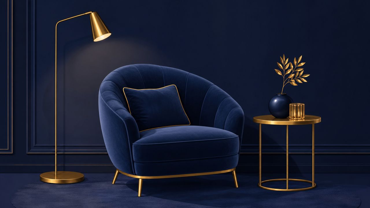
Navy and gold shifts the mood immediately. White makes navy feel crisp. Gold makes it feel dressed up. This is the pairing for homeowners who want a room to feel a little richer without committing to something flashy.
The easiest mistake is using too much metallic. Gold works best as punctuation, not the whole sentence. A navy velvet chair with a brass floor lamp, a mirror frame, or cabinet pulls feels elegant. A room full of shiny gold surfaces can tip into hotel-lobby territory fast.
Where to use gold without overdoing it
Formal dining rooms and primary bedrooms handle this palette especially well. A navy upholstered bed can take gold-toned sconces beautifully. A dark dining room with navy host chairs, an Amish-made solid wood table, and warm metallic hardware feels substantial and welcoming.
These placements usually work best:
- Choose one metal finish: Brushed brass, aged gold, or satin gold. Mixing too many warm metals muddies the look.
- Keep fabrics soft around it: Ivory bedding, cream drapery, or matte upholstery helps gold look intentional instead of harsh.
- Use gold where the eye lands naturally: Lamps, pulls, frames, and light fixtures do more than gold side tables or oversized decor objects.
Tip Top's article on what you should know about metal accents is especially useful for deciding whether the room wants brass, nickel, or another finish. For most Capital Region homes, brushed and aged finishes are easier to live with than polished gold because they don't call attention to every fingerprint or glare point.
3. Navy & Cream/Ivory
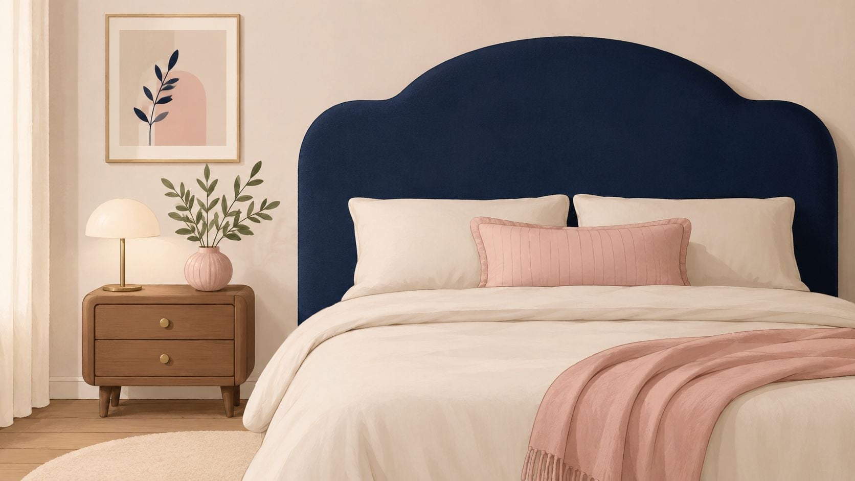
Some rooms need less contrast and more comfort. That's where cream and ivory earn their keep. They soften navy without draining away its depth, which is why this is one of the most reliable colors that go with navy for family homes.
This pairing is especially useful when a homeowner likes the idea of navy and white but doesn't want the sharper, coastal edge that white sometimes brings. Cream walls with a navy sofa, or ivory bedding with a navy bed, feels quieter and warmer.
Best rooms for this softer look
This palette works well in bedrooms, traditional living rooms, and transitional kitchens. In the Capital Region, where long winters make coziness matter, cream often outperforms stark white in rooms meant for everyday use. It reflects light gently and gives navy something softer to lean against.
There's one trade-off. Cream and ivory have undertones, and they can fight each other if they aren't coordinated. A yellow-leaning cream next to a pink-beige rug can look accidental.
Cream is forgiving. Mixed undertones are not.
To keep this palette grounded, natural wood matters. Oak, maple, cherry, and walnut all help navy and cream feel collected rather than staged. Homeowners who want to add color through upholstery, bedding, rugs, or casegoods instead of repainting can get ideas from Tip Top's guide on how to add color to your home without painting. This is also one of the best palettes for Amish furniture because solid wood brings exactly the warmth the navy needs.
4. Navy & Soft Gray
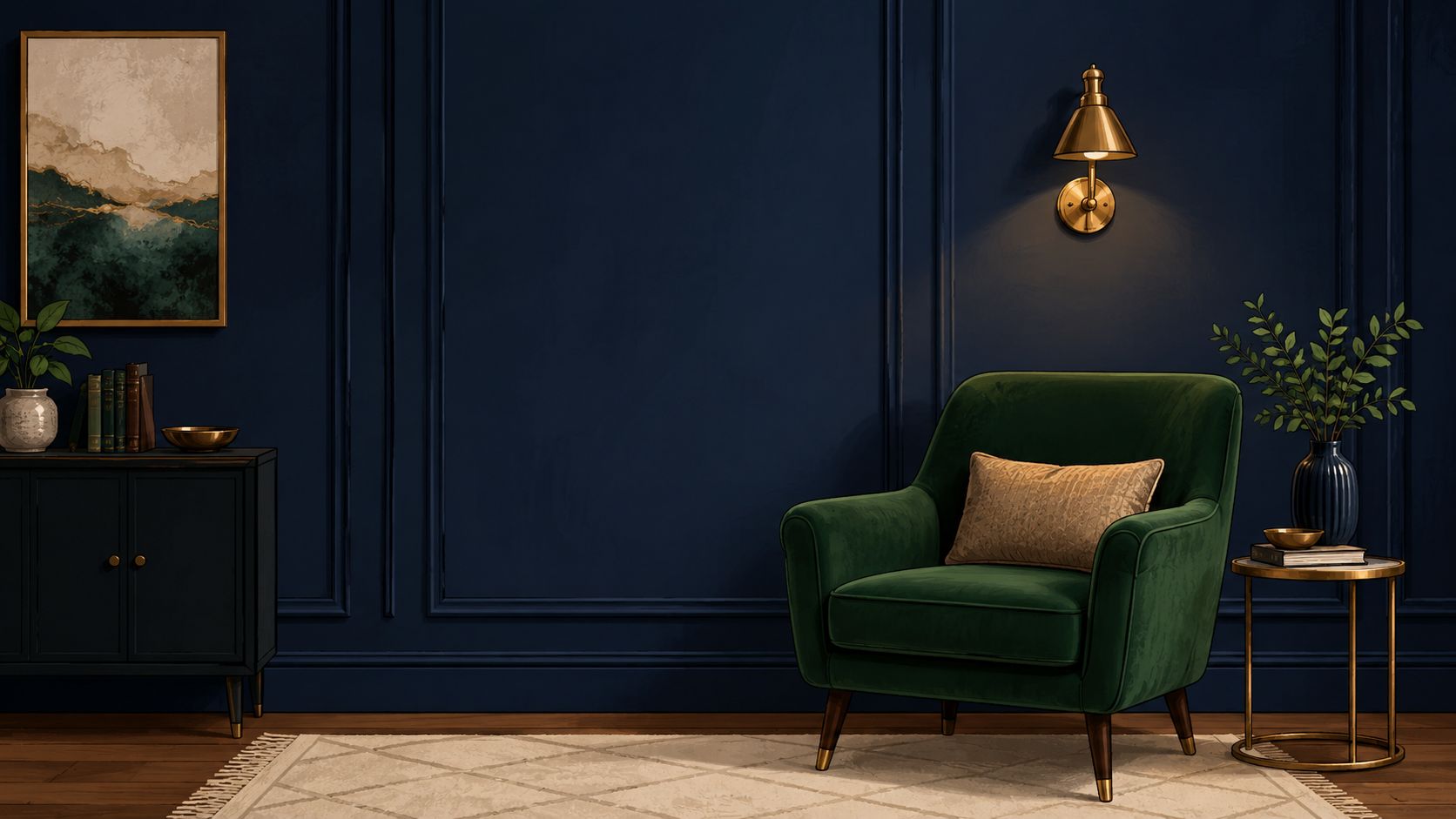
Soft gray and navy make a room feel calm, tidy, and current. This combination works well when the goal isn't contrast or drama, but composure. It's a natural fit for bedrooms, studies, and home offices.
The caution here is temperature. Cool gray plus cool navy can turn a room flat if there isn't enough softness elsewhere. That matters even more in northern light, where dark colors can read deeper and less reflective.
How to keep gray from turning cold
For navy-based palettes, high-lightness neutrals such as white, ivory, light gray, and beige help preserve legibility and visual separation. Dura Supreme also notes that navy works well with gray, white, taupe, and beige, along with brushed brass or nickel finishes, which is practical guidance when coordinating cabinetry, hardware, upholstery, and flooring in real rooms, as shown in its discussion of navy blue in interior design.
That advice translates well in real homes around Schenectady and Troy. A soft gray wall with a navy accent chair feels polished. A navy wall with a charcoal rug and dark wood floor can feel heavy.
A few adjustments usually fix it:
- Lean warm with the gray: Greige and taupe-grays are easier to live with than icy grays.
- Break up dark surfaces: Add a pale rug, light bedding, or creamy drapery.
- Use reflective finishes carefully: Brushed nickel, satin brass, and glass lamps help bounce light around.
For finishing touches, texture matters as much as color. Homeowners choosing a rug for this palette often benefit from guidance like this piece on selecting the right grey rug, especially when trying to keep a gray-and-navy room from feeling one-note.
5. Navy & Warm Beige/Tan
Navy and beige doesn't always get the attention of navy and white, but it's one of the easiest combinations to live with. It feels natural, familiar, and flexible. For many Upstate New York homes, that matters more than trendiness.
This pairing shines when the room already has warm materials. Beige walls, tan upholstery, wicker, leather, linen, and wood floors all support navy without competing with it. That's why this scheme works so well for homeowners who love Amish furniture, traditional tailoring, and layered textures.
Why this pairing feels easy to live with
Warm beige takes the edge off navy and keeps the room from looking formal. A navy sofa with tan leather accent chairs looks grounded. A beige bedroom with navy bedding feels restful without becoming bland. In dining rooms, a solid wood Amish table with navy upholstered side chairs often lands right in the sweet spot between polished and comfortable.
The best results usually come from letting beige do more of the background work.
- Use beige on bigger surfaces: Walls, drapery, rugs, and larger upholstery pieces help lighten the room.
- Bring navy in with intention: Upholstered dining chairs, a statement sofa, or a patterned area rug works better than scattering tiny navy accessories everywhere.
- Let materials do part of the work: Jute, sisal, leather, wool, and unfinished-looking woods give the palette depth.
This is also a smart route for homeowners shopping one room at a time. Beige plays nicely with existing flooring and wood tones, so navy can be introduced through a new sectional, upholstered bed, or occasional chair without forcing a whole-house redesign.
6. Navy & Blush Pink
Blush pink surprises people until they see it in a finished room. Then it makes sense. Navy gives the structure. Blush softens the edges. The result can feel current and polished instead of overly sweet, if the pink stays muted.
This works especially well in bedrooms, dressing spaces, and living rooms that need warmth without going beige. A navy headboard with blush bedding, or a navy sofa with a pair of blush accent pillows and a warm lamp, creates contrast that feels gentle rather than sharp.
How to keep blush sophisticated
The shade choice does most of the work. True blush, dusty rose, and pale pink-beige tones are far more successful with navy than bright pinks or peachy salmon shades. Those stronger versions can make navy feel abrupt.
A balanced room usually includes a third quiet element, such as ivory, oak, or brushed metal. That extra layer keeps the palette mature.
- Use blush as an accent first: Pillows, art, throws, or a bench are safer than an entire blush wall if the homeowner is unsure.
- Add one warm metal: Brass or rose-toned hardware can tie navy and blush together.
- Anchor with wood: Medium wood furniture keeps the room from floating into a too-delicate look.
Tip Top's piece on color coordinated setting the mood is a helpful read for homeowners trying to decide whether their room wants a softer romantic mood or a cleaner crisp one. In most cases, blush works best when it supports the navy rather than tries to compete with it.
7. Navy & Forest Green
Navy and forest green is a richer, moodier pairing. It doesn't rely on contrast as much as depth. When handled well, it feels elegant and cocooning. When handled poorly, it can feel like the lights are always dim.
This palette suits formal dining rooms, libraries, dens, and bedrooms where atmosphere matters. A navy wall behind a forest green chair can look handsome and layered. In a dining room, navy drapery and green upholstered seats around a wood table create a collected, old-world feeling.
Best ways to add contrast
The secret is adding relief. Two dark cool tones need breathing room, especially in rooms with limited sunlight.
A navy and green room almost always needs one light element and one warm element.
That light element might be cream curtains, an ivory rug, or pale artwork. The warm element might be walnut, brass, or warm lamp light. Without those additions, navy and green can blur together.
A smart way to use this palette is to let navy lead and green support. For example, a navy sectional with forest green pillows and plants is easier to manage than equal amounts of both colors everywhere. Natural wood furniture also helps tremendously here. It keeps the room feeling rooted instead of theatrical.
This is one of the best colors that go with navy for homeowners who want something more distinctive than neutrals but still timeless enough to last.
8. Navy & Coral/Peach
You walk into a navy room that feels a little heavy by February. Coral or peach can warm it up fast, especially in Upstate homes where long winters and cooler daylight can make dark colors feel more serious than intended.
This pairing has more energy than navy with blush, but it still feels livable when the warm tone stays soft. Coral brings more punch. Peach is easier to live with day to day, especially alongside oak floors, cream upholstery, and the wood finishes many Capital Region homeowners already have.
I usually recommend this palette for family rooms, breakfast areas, and guest bedrooms. A navy sofa with peach pillows, a coral artwork above a wood console, or navy dining chairs with a peach runner gives the room some lift without pushing it into a beachy or juvenile look.
How to use coral and peach without overdoing it
Start with navy in the larger pieces. Upholstery, a painted cabinet, or an area rug gives the room its structure. Then bring in coral or peach through smaller layers you can swap out seasonally if your taste changes.
A few guidelines help:
- Choose muted coral over bright orange-coral: It looks more settled and less trendy.
- Use peach where you want softness: It works well in drapery, bedding, and accent pillows.
- Ground the palette with natural materials: Maple, oak, cane, and woven textures keep the color mix comfortable and approachable.
- Add a warm accent with intention: If you like this direction, our guide to styling burnt orange curtains with confidence can help you judge how much warmth the room can carry.
For homeowners visiting our Freehold showroom, this is often a smart custom route. Start with a navy sectional, dining set, or Amish bedroom piece in a steady wood tone. Then build the coral or peach around it with rugs, lamps, art, and fabric. The larger investment stays timeless, and the warmer accent color can shift as your room evolves.
9. Navy & Soft Yellow/Butter
Soft yellow can make navy feel friendlier and brighter. Done well, it has a classic charm that suits kitchens, breakfast nooks, and sunrooms especially well. Done poorly, it can look either too primary-school bright or too washed out.
The key is staying in the butter range. Pale, creamy yellow has enough warmth to soften navy without fighting for attention. It works beautifully with white trim, wood floors, and simple upholstered pieces.
How to avoid a dated look
A lot depends on where the yellow appears. Walls can work, but only if the tone is muted. More often, soft yellow shines in accessories, drapery, painted stools, or breakfast-room cushions.
This pairing benefits from restraint.
- Avoid bright primary yellow: It can make navy look harsher and less refined.
- Use white trim or ivory fabrics: Those lighter notes keep the palette fresh.
- Bring in wood for balance: Oak, maple, and cherry all help yellow feel established rather than sugary.
In a kitchen or eating area, navy lower cabinetry with soft yellow accents can feel welcoming and cheerful. In a living room, the better route is usually a navy foundation with touches of butter through pillows, lampshades, or art. This is one of the more personality-filled colors that go with navy, but it needs a steady hand.
10. Navy & Warm Terracotta/Rust
Terracotta and rust give navy something earthy to push against. The result feels grounded, collected, and warm, which is why this pairing has such staying power in homes with wood furniture, woven rugs, pottery, and layered textiles.
It's also one of the best ways to make navy feel less formal. Rust tones bring in a lived-in quality that works well in family rooms, dens, and dining spaces. A navy sofa with rust pillows and a wool rug feels comfortable and intentional. A navy dining chair paired with warm wood and clay-toned decor feels welcoming.
How to make it feel collected, not themed
The biggest mistake is choosing orange instead of terracotta. Orange can look loud against navy. Terracotta, clay, cinnamon, and rust are more natural companions because they have some brown in them.
This palette usually improves with tactile materials:
- Use matte finishes: Clay pottery, linen, wool, leather, and aged wood all support the look.
- Keep a light note in the room: Cream walls, a pale rug, or off-white drapery prevents the palette from getting too heavy.
- Repeat the warmth in small ways: One rust pillow and one pottery vase can look random. Several small warm notes feel intentional.
Recent design coverage also points to a broader issue homeowners often overlook. Navy is a deep, low-reflectance color, so it can read much darker in dim or north-facing rooms. Pairing it with higher-lightness neutrals such as warm white, cream, sand, and light gray helps preserve contrast and keeps spaces from feeling closed in, especially in compact rooms, as explained in this overview of colors that go with navy blue. That matters with rust and terracotta because both are richer, deeper accents.
For window treatments and accent ideas in this family of tones, Tip Top's article on styling burnt orange curtains offers practical direction that translates well to navy-based rooms.
10 Color Pairings That Complement Navy
After homeowners walk through all ten options, the usual question is practical. Which pairing fits the room, the budget, and the amount of effort you want to put into it? That is where a quick decision table helps most. Instead of repeating the design advice above, this version focuses on what each palette asks from you in a real Upstate New York home.
| Color Pairing | Best Room Conditions | Budget Reality | DIY Difficulty | What to Buy First | Best Local Fit |
|---|---|---|---|---|---|
| Navy & White | Rooms that need brightness, especially with limited winter light | Usually one of the lowest-cost pairings because white is easy to source in paint, rugs, and bedding | Easy | Start with wall paint, curtains, or a light area rug | Great for condos, smaller bedrooms, and family rooms that need contrast |
| Navy & Gold | Rooms with enough light to catch warm metal finishes | Moderate, since lighting, hardware, and mirrors can raise the total | Moderate | Swap in lamps, pulls, or a mirror before buying larger pieces | Works well in dining rooms, formal sitting rooms, and primary bedrooms |
| Navy & Cream / Ivory | Spaces that need warmth without feeling yellow | Moderate, especially if you are replacing multiple textiles | Easy to Moderate | Begin with upholstery, bedding, or drapery | Strong choice for traditional homes, farmhouses, and rooms with medium-tone wood |
| Navy & Soft Gray | Rooms with steady natural light or plenty of layered lamps | Moderate | Moderate | Test the gray in a rug or throw first so undertones stay controlled | Useful in home offices and bedrooms where you want a quieter mood |
| Navy & Warm Beige / Tan | Rooms with wood floors, beams, or natural textures already in place | Often cost-friendly because it works with many existing finishes | Easy | Start with a rug, accent chair, or wall color | One of the easiest palettes to build around Amish furniture and hardwood flooring |
| Navy & Blush Pink | Bedrooms and smaller sitting areas where softer contrast makes sense | Moderate | Moderate | Add pillows, art, or a bench before committing to larger upholstery | Good for guest rooms, reading corners, and spaces that need some softness |
| Navy & Forest Green | Larger rooms or rooms with strong lighting so the palette does not feel too dense | Moderate to High because layering matters | Moderate to Advanced | Begin with plants, artwork, or one upholstered accent | Best in libraries, dining rooms, and living spaces with height or generous windows |
| Navy & Coral / Peach | Rooms that need warmth and energy without going loud | Low to Moderate | Easy | Use accessories first, such as pillows, pottery, or art | Helpful in casual family spaces, kitchens, and homes that need a lighter mood |
| Navy & Soft Yellow / Butter | Darker kitchens, breakfast areas, and rooms that need a sunnier feel | Moderate | Moderate | Try it in paint, seat cushions, or window treatments | A smart option for older Capital Region homes that need warmth during long gray seasons |
| Navy & Warm Terracotta / Rust | Rooms with natural materials, warm woods, or leather already present | Moderate | Moderate | Start with textiles, pottery, or an accent chair | Especially good in transitional and rustic homes, and with custom wood case goods |
A few patterns show up again and again in the showroom. White, beige, and cream are the easiest to live with long term and the easiest to refresh. Gold, blush, and forest green ask for more restraint, because one wrong finish or undertone can pull the room off balance.
For homeowners furnishing from scratch, navy with warm beige or cream is often the safest place to start. It works with a wider range of flooring, wood stains, and custom Amish dining or bedroom pieces, which matters if you are coordinating more than paint and pillows. If the room already has strong architecture or plenty of daylight, gold, forest green, or terracotta can add more character without making the space feel heavy.
The right pairing is not just about color theory. It is about how the room lives, how much light it gets in January, and whether you want quick cosmetic updates or a full-room plan with furniture, flooring, and finishing touches chosen to work together.
Bring Your Vision to Life in Freehold, NY
Navy works because it's flexible. It can look crisp with white, warm with cream, polished with gold, relaxed with beige, fresh with peach, or earthy with terracotta. That range is what makes it such a strong foundation for real homes across Albany, Schenectady, Troy, Greene County, and the wider Capital Region. It doesn't box homeowners into one style.
The main decision isn't whether navy works. It's which version of navy works for the room. Some spaces need contrast to feel open. Some need warmth to feel inviting. Some need a little shine, and some need softer supporting colors so the room doesn't feel too dark through long Upstate winters.
That's where seeing materials in person helps. Paint chips can only do so much. Upholstery, wood finish, flooring tone, lamp light, and wall color all affect how navy reads. A navy performance fabric sectional looks different beside beige carpet than it does beside warm hardwood. A navy bedroom set can feel stately with ivory bedding and too severe with cool gray if the room doesn't get much natural light.
Tip Top Furniture & Mattresses makes that process easier because the showroom approach is built around coordinating the whole room, not just selling a single piece. Homeowners can compare living room, bedroom, dining room, home office, décor, and flooring options in one place at the historic Freehold, NY showroom. The store has served the region since 1978, and its professional design services date back to 1984, so homeowners don't have to guess their way through undertones, scale, or finish combinations.
This is also where local one-stop shopping becomes practical. A homeowner can start with a navy sofa, then coordinate an Amish-made end table, a lighter area rug, flooring samples, and custom-order fabric options without piecing the project together across multiple stops. For budget-sensitive projects, flexible payment options and in-stock opportunities can help move a room forward in manageable steps.
For anyone ready to turn navy from a paint-chip idea into a finished room, Tip Top Furniture & Mattresses is one relevant local option for furniture, mattresses, décor, custom ordering, and coordinated design help in the Capital Region.
Visit Tip Top Furniture & Mattresses to explore furniture, décor, flooring, custom order options, and room-planning support for your next navy-inspired space. Homeowners across Freehold, Albany, Schenectady, Troy, and the wider Capital Region can also ask about design consultation services and flexible financing for a smoother home update.